
You know that you’re unique and that you have specific value to offer. But if you’re expecting prospects to wait around and be convinced, then you’re missing a lot of opportunities.


You need to catch their eye, stand out and be remembered. And, considering the pace of the world we live in, the sooner you get their attention, the better.
If you’re not using a visual language to speak to your audience, then you’re ignoring a huge opportunity to capture their attention without saying a word. Even worse, a lack of a deliberate visual identity is already saying a lot about you. The only problem is, you’re not in control of the message that is being sent.
Given that humans are a visual species, it’s no wonder that large brands have strict brand guidelines. They plaster their logo on everything available to them and protect it with a fierce legal team. Companies like Coke, Tiffany’s and Cadbury have gone so far as to copyright colors, making sure that no one else is co-opting the power of their brand through association.
So why all the fuss? Why is your logo so important?
What can a business logo do for you?
Like any part of a visual brand identity, a logo is a way to build a relationship with your audience. Once your business has moved past the meet-and-handshake stage, it’s easy to become anonymous. All of the hard work, the solid reputation, the personality of your business becomes more difficult to hold onto and to communicate.
A logo is a tool to translate your company’s values to your audience, and to build stronger (or even new) relationships.
How?
A Logo Makes You Memorable
At its most basic, a logo differentiates you from your competition and makes your more memorable. If you read or hear a name you might remember it. Add an image and you are more likely to remember it. It’s a basic mnemonic device, and it’s the basic job of your logo.
Hundreds of years ago, a logo simply indicated who had made the product. That custom developed into where we are today, when a logo indicates who the maker is and who the audience is. A great logo makes a product or company stand out from the crowd. It’s a bigger world now, and a logo has a lot more to do.
Examples:

MailChimp
The online email management company recently started using their monkey icon as a stand-alone logo, pairing it less and less with the company’s wordmark. It’s a common (and desirable) step for branding: that point when your logo alone is enough to identify your company, without needing to indicate the company name. Logos are THAT memorable.
Your Business Logo Tells Everything at a Glance
Your logo boils down who you are as a company, what you’re offering and who you are offering it to into a single memorable image. This doesn’t need to be spelled out.
As consumers, most people are surprisingly adept at translating logos and branding . We’re surrounded by logos, so we’ve learned the language. Colors, images and many other small cues instantly frame a logo in a specific way.
Curvy feminine lines speak to a different audience than angular shapes, much like pastels versus metallic colors. Elegant, thin lines can denote a luxury item and a higher price range than brightly colored, fatter, slightly askew designs might.
All it takes is a few seconds for a prospect to process and classify your logo and company as being appropriate for them and their needs, or not. A logo needs to work quickly to prove itself. If it doesn’t, the prospect will move on.
Examples:

Ferrero Rocher
“This is a high end product.” That is what this logo says. And we know that. How? The elegant uppercase letters, the swoops of the calligraphy—often a logo will tell us its price point before we even look at the sticker. We are trained to know that, because Ferrero Rocher makes chocolate, *this* chocolate is going to be a bit fancier, a bit more luxurious than other chocolates. This is a luxury item. We know, because we speak logo.

Fisher Price
This is a good example of a business logo that speaks the language of its market. The font is easy to read, but not too formal—lots of rounded edges and slanted lines, complete with little flippy tips. Here, the red reads as a children’s color (as do most primary colors when paired with the right font).
The little circus-like awning makes it more playful, and gives in a sense of history. Fisher Price has been around for a long time. They don’t need to say much, but what they do say is “Hey, this is for kids!” And because we speak logo, we know what they’re saying.
Your Logo Acts as The Face of Your Brand
All of the hard work that you are doing—the great content, the feedback, the relationship building—gets placed behind your business face, which is your logo. In the same way that you build in person relationships, your logo builds relationships with your audience. You’re no longer a faceless entity.
In his book The Brand Gap, Marty Neumeier explains that your brand isn’t your visual language. It is the gut feeling that your audience has toward your company and your product. Your logo and your visual identity are a receptacle for these feelings. These translate your brand so that your audience can build a personal relationship with your company.
Examples:

I (Heart) NY. Designed by Milton Glaser (Push Pin Studios)
The NY brand is so iconic that it’s been mimicked and knocked-off an infinite number of times—but we all still know that it’s about New York. Created at a time when NYC wasn’t perceived as the friendliest of tourist destinations, Glaser’s design cut to the “heart” of the matter and spoke instantly to the love that New Yorkers and visitors had for that city. Now, you can’t leave NYC without this logo emblazoned on SOMETHING. Whatever New York means to you, it’s attached to this logo.

NIKE. Designed by Carolyn Davidson
When presented with the design in 1971, Nike co-founder Phil Knight said about the now iconic swoosh: “Well, I don’t love it, but maybe it will grow on me.” Davidson, a design student at Portland State University where Knight was employed at the time, was paid $35 for the design. Her swoosh would come to embody NIKE’s entire reputation and brand identity, becoming one of the most recognizable logos in the world.
Your Logo Builds Loyalty
The feeling that a consumer has for a brand can be a powerful one. Brands have become badges that people use to identify themselves. If you use or know someone who uses Apple computers, you are already familiar with rabid brand loyalty. The same can be said about sports teams, soft drinks or clothing companies.
It’s not just a matter of recognizing great products or great value and associating these with your logo, although that is valuable. When your logo speaks to who your audience is or who they want to be, then it becomes an identifier for them as much as for you.
Examples:

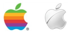
Apple (1977 version, designed by Rob Janoff & current Chrome version)
It’s hard to think of more brand-crazy fans than Apple users. Rabid i-Fans will stand in line for days waiting for the newest product. The logo itself is emblazoned on storefronts, products and even unofficial merchandise. No brand name is required.
In my work as a graphic designer, the Apple logo is the most popular reference that clients make when they are looking for a logo design. Everyone wants to be Apple.
Your Logo Dresses the Part
In today’s brand-heavy consumer world, not having a logo sends a strong message. Have you ever heard the phrase, “If you want to know how clean a restaurant’s kitchen is, visit the bathroom”? If so, you know that the devil is in the details.
If a bathroom isn’t clean, are you going to trust those same people to prepare your food? If a business can’t be bothered to present themselves professionally, are you going to trust them with your money?
In today’s world, visual branding is expected from any reputable business. It’s really the price of entry into a professional sphere. A logo says a lot. Not having a logo says a lot as well.
Which are you more likely to trust: a faceless company on the internet, or a well-established, serious-looking brand with a friendly logo and professional design?
Examples:

Mint.com
Mint.com is a free online personal financial management program. It draws information from the bank and credit accounts that you enter, so it requires a great deal of trust from its customer base.
How does the logo promote that trust? It fits together well, uses the appropriately trustworthy colors and has definitely been designed by a professional. That wouldn’t be enough proof for most of us, but a bad logo design would be a red flag.
Now What?
The visual language of logos and branding can help you communicate more effectively and more rapidly with prospects. It can translate your value and hard work more easily into ongoing relationships with your audience.
If you are convinced of the value of that a logo and a large visual identity can do for your business, then you’re probably already looking at your branding materials and thinking that you could do better. And if you haven’t looked at your branding materials lately, perhaps now is the time! What’s holding you back?
This article was originally published by Firepole Marketing
Author: Christina Gunn joined Firepole Marketing in 2013 as the Design Lead. Her obsession with branding and visual language means that she’s thrilled to oversee the Firepole Marketing “look” and to work with students as they find their visual voice. Her portfolio work can be seen at christinagunn.ca.
Published: February 24, 2014
2479 Views
2479 Views
