7 Core Website Ingredients You Should Never Mess Up
By: SmallBizClub

Building a website that is able to drive visitor engagement, lead generation and conversions isn’t easy these days. Blame it on the number of sites that are competing against each other to get a slice of attention from their target audience. According to Internet Live Stats, there are 1,063,766,000 websites online right now; that is right now when I am writing this post. This figure will increase dramatically by the time you get down to reading this post.
This figure gives you a sense of perspective about the challenges involved in making a website, and not just a website but a successful site. Irrespective of your business niche, you are going to have a tough time attracting the attention of your target audience with your website. This is why you need to get your website setup absolutely right. There are no half chances here.
There are certain things about your site that are you just cannot afford to mess up. Do that and you will have failure on your hands, but get these ‘ingredients’ right and your website’s chances of making a mark go up considerably.
Let’s take a look at 7 such ingredients:
1. Usability
Usability essentially means keeping the users’ needs in mind while designing a site. What you are essentially doing is making design decisions driven by user expectations. A usable website:
- Enables users to achieve their goals on your site.
- Makes browsing an enjoyable experience.
- Ensures website recall.
- Drives repeat visits.
- Increases word of mouth of your site and improves its chances of going viral.
Usability directly impacts the ability of the site to engage visitors and acts as conversion catalyst. In order to come up with user-driven design, you first need to understand who your potential visitors are, what do they want, what will they appreciate on your site and what will make them want to spend more time on your site. Once you get your target audience sorted out, planning and implementing ‘usability’ into your web design will be much easier.
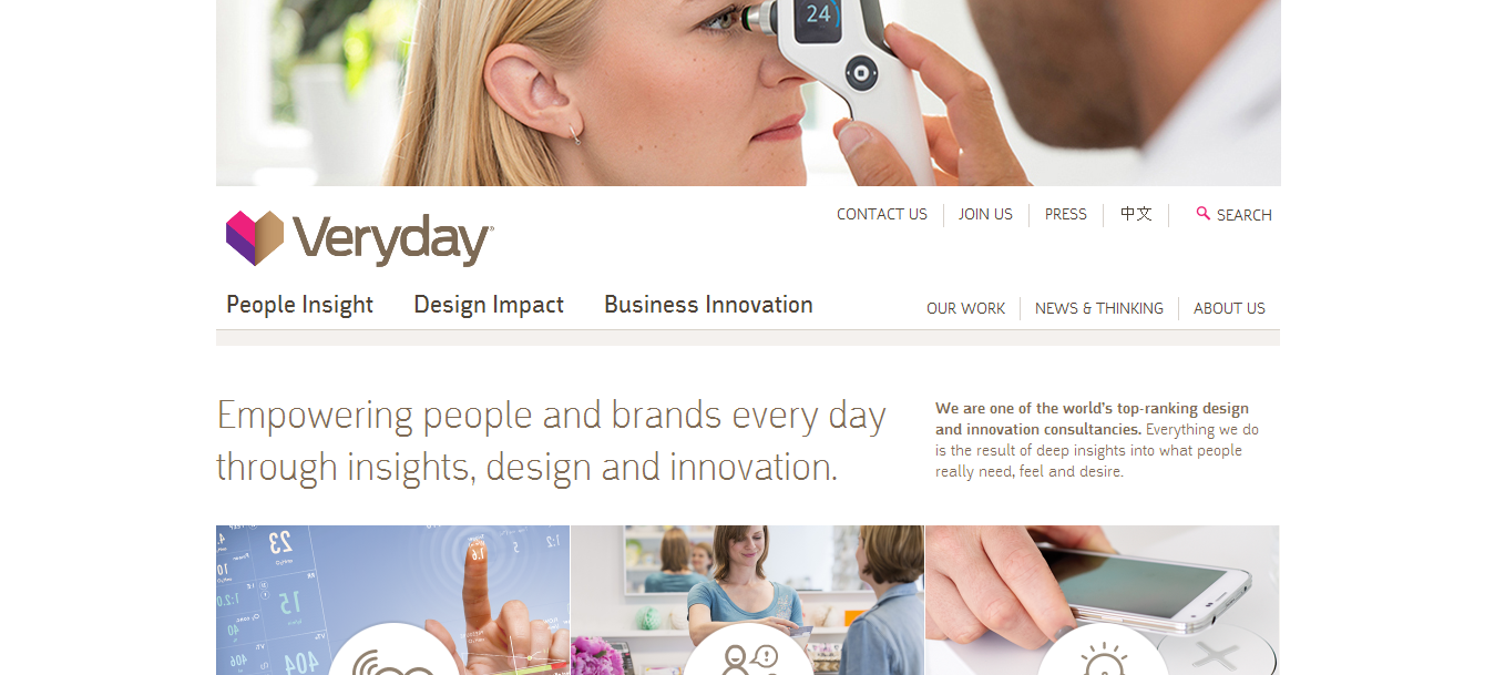
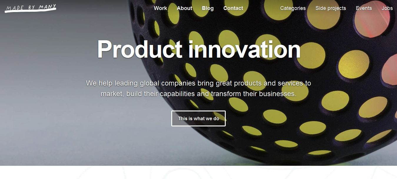
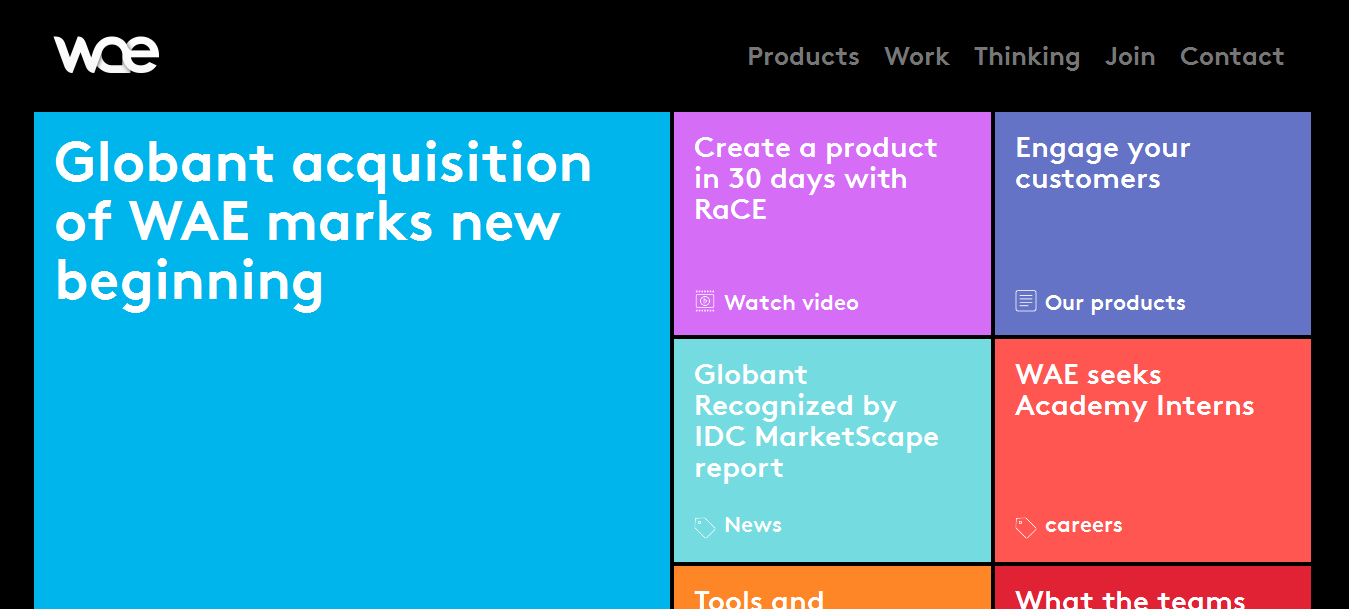
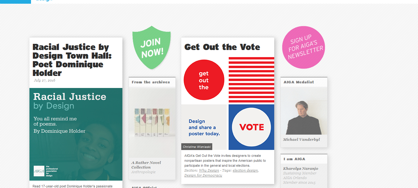
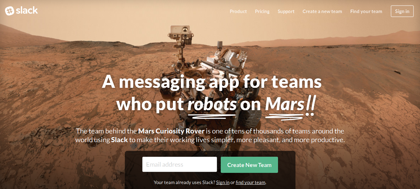
Examples of sites with amazing usability:
2. Color Scheme
Choosing the right color scheme for your website is both an art and science. Yes, you must choose a set of colors that look good but you should also check whether they are aligned with the core messaging of your site and will drive the actions of your visitors.
This graphic by Kissmetrics makes for interesting reading to get an idea about gender based color preferences. It offers some interesting insights including:
- Men don’t like Brown; women don’t like Orange.
- Men like bright colors; women like soft colors.
- Men prefer shades; women prefer tints.
There are some other facts regarding colors that are quite interesting too:
- Blue symbolizes trust, credibility, and stability.
- Green symbolizes growth.
- Yellow symbolizes energy.
- Red reflects strength and war.
(Source: Color Wheel Pro)
The colors you use on your site have a huge psychological impact on visitors; although they don’t realize it, many of the emotions they are feeling when they visit the site result from the color scheme used. If you don’t use colors to your advantage, you are missing out on capitalizing an important element that can drive website conversions.
The next time you visit a site you know is successful, take a good look at its color scheme. You will realize that the color scheme in itself acts as a call-to-action.
3. Textual Content
There is one thing common amongst all effective website content – It is persuasive. Great website content persuades people to know more about the site and increases the time spent on the site. It is also direct, self-explanatory, easy to read and accurate. It’s important you don’t try tricks with textual content on your site. Web users behave like animals (when they forage for food) when they are foraging for information. The site/source offering the information they need quickly and easily is chosen over sites that make it difficult to get information.
So, in order to make your website’s textual messaging instantly appealing to visitors, make sure:
- You use short paragraphs.
- Write in easy to understand English – Don’t use difficult words.
- Ensure messaging is direct and in the active voice.
- Don’t repeat the same point again and again.
- Use short sentences.
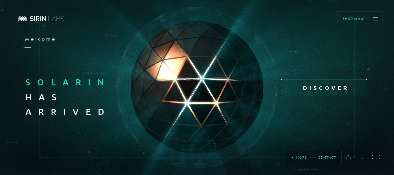
A few examples of content heavy sites that excellently weave content into their designs:
4. Images
Most successful websites have great imagery. There is a real effort to ensure that the images are of very high quality, unique, impressive and relevant. What’s more, the images are used to enhance the brand message. If you don’t choose the right images, your website will suffer from the engagement point of view and will look boring. Nobody likes a site that uses common imagery that visitors will find across many other websites on the internet.
The key here is budget. You need to factor in a specific budget to buy exclusive images or hire a photographer to shoot the kind of images you want. I know this sounds difficult and there are businesses who can’t invest a lot of money to create a website, but the importance of images necessitates some monetary investment. The use of right images on your site can improve conversions, isn’t that the primary objective of your site?
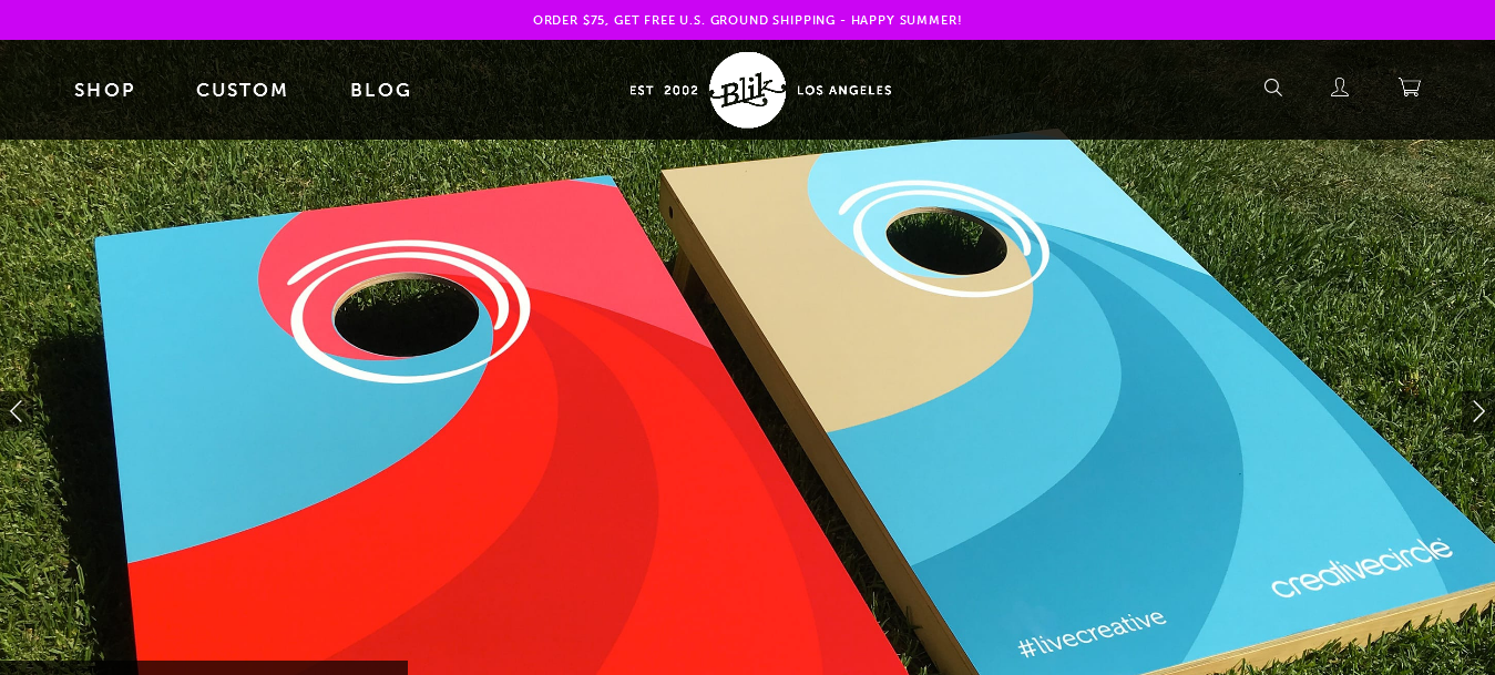
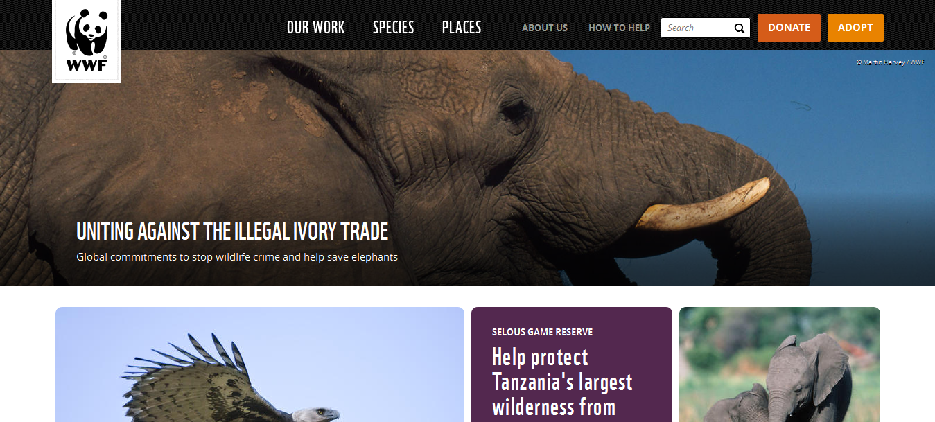
A few examples of websites that have used images the way they must be used:
5. Call- to-Action Buttons
Another important ingredient of a successful website is an effective call-to-action button. Strategic call-to-action buttons (CTAs) are cardinally important for a website as they drive lead generation and increase conversions. Imagine the number of times you have actually filled in a website signup form without realizing that it was the CTA that was the cause of your action.
Effective CTAs have actionable content, the right color, large text that is easy to read, are easily visible and have a sense of urgency. If your website’s CTAs are a coming together of these qualities, they won’t fail. There is something else you need to keep in mind. Don’t pack a web page with multiple CTAs; less is always more when it comes to such buttons. More buttons will just confuse the visitor, so keep it pretty straightforward. Also, while you can get creative with your buttons, it’s imperative you don’t go overboard with your creativity. Visitors aren’t looking for creativity when it comes to CTAs; all they want is that these buttons are woven seamlessly into the website setup.
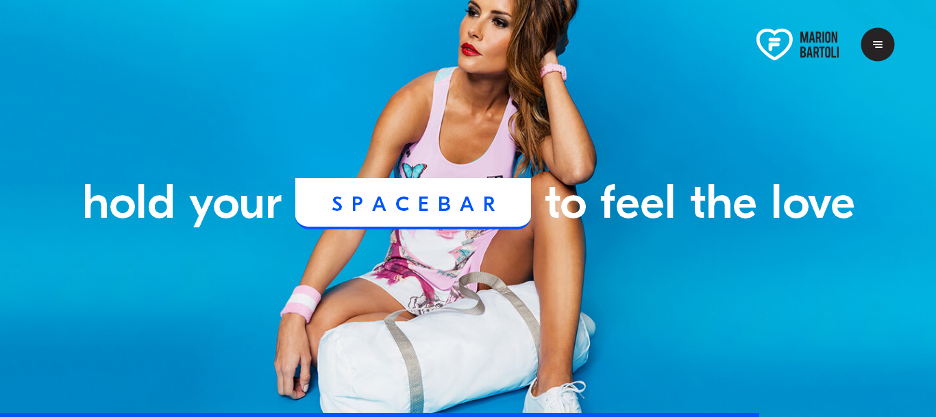
A few examples of great CTAs:
6. Visual Harmony
Unity and consistency are the hallmarks of all great web designs. There should be harmony between all the elements on a website, which means they should all work together to achieve website goals. What you are essentially doing is ensuring that each ‘ingredient’ mentioned in this article is supporting the other and working together towards a common goal. There is one clear message delivered to website visitors, which essentially means they know what to do, where to go and what to understand on your site.
If there is no visual harmony on your site, it will look like all elements are placed in a haphazard manner. This gives an indication that there wasn’t a lot of thought given to the website’s creation, which can be taken as an insult by your website’s audience.
7. Sense of purpose
This is an extension of the earlier point. Your website should have a clear sense of purpose meaning it must be clear about the message it wants to deliver. Therefore, before thinking about building a website, think about why you want to build a website and what you hope to achieve. Once you answer these questions, you will have a clear idea about how you want to make the website and the core ingredients you wish to use.
Conclusion
The whole idea is to give the website building process enough time to ensure you get your website absolutely right. Don’t rush it All good things take their time and so does a website. This way you can guarantee that all the ingredients mentioned here, do their job perfectly on your site and deliver high ROI.
Author: Aigars Silkalns is CEO and founder of Colorlib, a company that develops website templates, WordPress themes and is behind several best-selling products. He has been in web development for 3 years and internet marketing for 7+ years, and that’s just the beginning.
2550 Views
Trending Articles