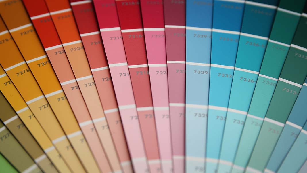
For the first time ever, Pantone picked two complementary colors as its Color of the Year for 2016. Serenity (Pantone 15-3919) and Rose Quartz (Pantone 13-1520) play off each other to achieve balance in a world that seems perpetually divided in myriad ways.
But what goes into the selection process, and how can you strike a balance between the desire to always want something new with also wanting things to last longer and be less disposable?
According to Leatrice Eiseman, executive director of the Pantone Color Institute, her group doesn’t just appoint the Color of the Year. The selection is actually the end result of a detailed global investigation of which colors are already ascending naturally and how those colors are being received.
This search includes finding the colors coming forward across disparate reference points, such as symbols of upcoming events, like the colors of an Olympics host city; artist retrospectives in museums; movies; animated films; television; fashion; and technology.
“What we do is try to read the pulse of the public, so to speak,” Eiseman says. “What are people asking for? What are they saying their needs are? What are they hoping for? What are their aspirations? We try to then pick out a color that speaks to that cultural reaction to color, the collective consciousness’s reaction to color, and the psychological and emotional impact.”
The colors selected by Pantone are determined in that balance between what is happening with colors naturally and the emotional desires of the public.
“With the response from the public, and with all the turmoil that is going on in the world around us, with people wanting something that is going to be relaxing and soothing and supportive and embracing,” Eiseman says, “we felt the Rose Quartz and the Serenity were the two colors that really brought together a sense of balance: one warm, one cool.”
But with more people trying to move away from supporting a disposable society that’s constantly fixated on the new, Eiseman says the point isn’t to immediately reupholster your (2015 Color of the Year) Marsala couch, but rather to strike a balance between longevity and trends.
She uses the analogy of someone who bought gray dishes in an effort to be responsible and pick a neutral tone. They won’t go out of style; they were a good investment; and there’s no reason you need to get rid of them.
“At the same time, we know that the human eye is titillated by novelty,” she says. “If you use those gray dishes every time you have friends over or you sit down to dinner, give it three years, and you’ll look at it and say, ‘Oh, you know, I’m having a party. I need to do something to spark the table up.’ That’s when you start to look for the trend colors, even though you might have some concern about the longevity.”
So, keep the gray dishes, but when you feel it is time for a change, explore new stemware, glassware, or chargers in a trend color, which adds a new look to the table while also freshening up the feel of the gray dishes. Another thing to think about when it comes to new motifs is to explore patterns.
“We rarely use color just in blocks of color,” she says. “There’s going to be a pattern or trend or some design that’s going to enter into the scheme. If you really sit down and analyze some of your prints and patterns, you may find that there is a pattern already coordinating the two new colors, as well as the gray.”
Another easy way to explore color is to add some paint to the walls, which is much cheaper than reupholstering sofas or buying new carpeting or table accessories.
“Even though it’s not as inexpensive as it used to be, when you compare it to the price of other similar products, it’s still a less expensive way to go,” Eiseman says. “If you have not only the gray dishes but gray furniture in your living room and you’re looking to make it look fresher, cleaner, and newer, maybe just one impact wall behind the gray sofa done in Serenity Blue might be the ticket. And if you get tired of it in a couple of years, another can of paint, and you’ve got it covered.”
And how does Eiseman react to having to not only stump for each color each year but also embody it personally when she goes out to speak in her own fashion and accessories?
“It’s a work hazard,” she says, laughing. “It’s a terrible thing to have to go out and shop for clothes because you have to wear them for your job! I love it, of course; I love the challenge. And we get very clever about how we do it. I’ve been known to get some nail polish out and change the frames on my glasses to the color of the year. That’s a quick, down-and-dirty way to do it. It makes you very inventive. You go into thrift shops, and you look at ways it was used before, and you have fun with vintage, and it just unleashes all kinds of fun as far as color is concerned.”
Ultimately, though, color trends don’t cycle every two months. Even Eiseman recalls getting a recent Christmas catalog from a retailer and seeing a lot of Marsala still being prominently displayed.
“So, it’s definitely out there—it lasts, and it doesn’t fall off the end of the earth next year,” she says. “What is most interesting that I see is integrating the colors from the years before. It unleashes the creativity. And, to me, that’s the name of the game. If it empowers people to try combinations they haven’t tried before, or if it starts a conversation about color, that to me is the most important thing. That engages people and gets their creative juices going.”


