Every day we’re bombarded by thousands of colors, and each one has an effect on our thoughts and emotions. Research reveals that we make subconscious judgments within just 90 seconds of viewing a product or space, and 62–90% of this judgment is based on color alone!


So it’s probably fair to say that color is kind of important when it comes to branding.
According to a study by the University of Loyola, Maryland, choosing the right color can increase brand recognition by 80%. Many of the world’s biggest brands are instantly recognizable by their color alone: think of McDonald’s (yellow), Facebook (blue) or Cadbury (purple).
So how do you choose the right colors for your brand? Here are some handy hints to help you make the right decisions.
What’s your brand personality?
Is your brand friendly and relaxed, adventurous and free-spirited or thoughtful and serious? Whatever your brand personality, you need a color scheme that accurately reflects it. Choose a color that doesn’t fit your values, and your brand runs the risk of feeling inconsistent and inauthentic.
Does you color scheme work in your market?
Some colors are better suited to certain industries than others. So research how color is used in your industry. Which colors are used most often? For example, red is used frequently by florists because of its association with roses, but avoided by healthcare companies because of its associations with blood!
Cultural context
Colors can have very different cultural attributes, so do your research if you work internationally. For example, white is often seen as pure and clean in the west, but in the east it’s associated with mourning.
Know your competitors
Successful competitors will have chosen their colors carefully, so these are proven to work in your market. However, you need to make yourself stand out, so being a copycat isn’t the answer.
Decide what your point of difference is; what makes your offering unique? Once you know, choose a color scheme based on this. This allows you to stand out in your industry without entirely departing from the colors that are proven to work.
The Color of Emotion
Today’s consumers are increasingly looking for an emotional connection with brands, and, as we know, color can have a big effect on how we feel and think (remember the 90 second judgment statistic?).
So with this in mind, let’s have a look at how different colors can cause different subconscious reactions. Bear in mind that these are generalizations about emotional responses in the western world, and remember that context plays a significant role too.
Red
Red is a very physical color, often associated with passion, power and strength. It’s high-energy, exciting and proactive.
Pink
The symbolism behind the color pink varies by intensity, but it’s almost always considered feminine. Hot pink conveys youthfulness and excitement, while dusky pinks are considered more sentimental. Lighter pinks are perceived as delicate and romantic.
Orange
Orange is a warm, high-energy color. It’s dynamic, exuberant and fun. It also makes us feel hungry and is commonly used in restaurant brand identities. Yum!
Yellow
Yellow is a happy and optimistic color. It’s positive, playful and associated with creative thought and energy. The human eye sees yellow before any other color, which makes it great for point of sale or warning displays.
Green
Green communicates freshness, health and serenity. It’s a color associated with natural products, adventure, relaxation, balance and safety. Light greens are calming, while deeper greens are associated with wealth.
Blue
Blue is seen as the calmest color, and is associated with intelligence and cleanliness. It’s perceived as trustworthy, dependable and secure. However it can also be seen as cold and emotionless, so be careful how you use it.
Purple
Purple is a mysterious, sophisticated color. It’s connected with spirituality, art, royalty, nostalgia and sentimentality. It’s also used to represent intelligence, luxury, vanity, fantasy and femininity.
Creating Your Brand’s Color Palette
For a basic color scheme, use three complementary colors: a base color and two supporting colors. A color wheel is a handy tool to find colors that work well together.
Analogous – Use colors adjacent to your base color to create a harmonious color scheme.
Complementary – Colors opposite each other contrast well, but you may need to adjust their shade to achieve the best effect. Find your third color by choosing a shade to the left/right of your base or complementary color.
Triadic – This is where the colors are equally spaced around the wheel. This is a good choice for beginners because it’s easy to get good results.
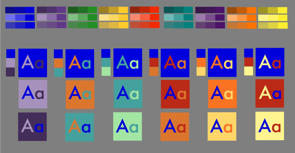
Example palettes with blue as a base color
So to sum up, there are no hard and fast rules when choosing your brand’s color scheme. But there are a few things to consider before you move on to the color wheel:
- Does the color scheme reflect your brand personality?
- Is it suitable for your market?
- Have you researched the color choices of your competitors?
- How is the color perceived across different cultures?
Author: This post was created by Rob Young, of business card printers MOO. Visit MOO online at http://us.moo.com/ to upload your own images or use our templates and start creating remarkable products
Published: February 5, 2014
3908 Views
3908 Views
Trending Articles

Stay up to date with