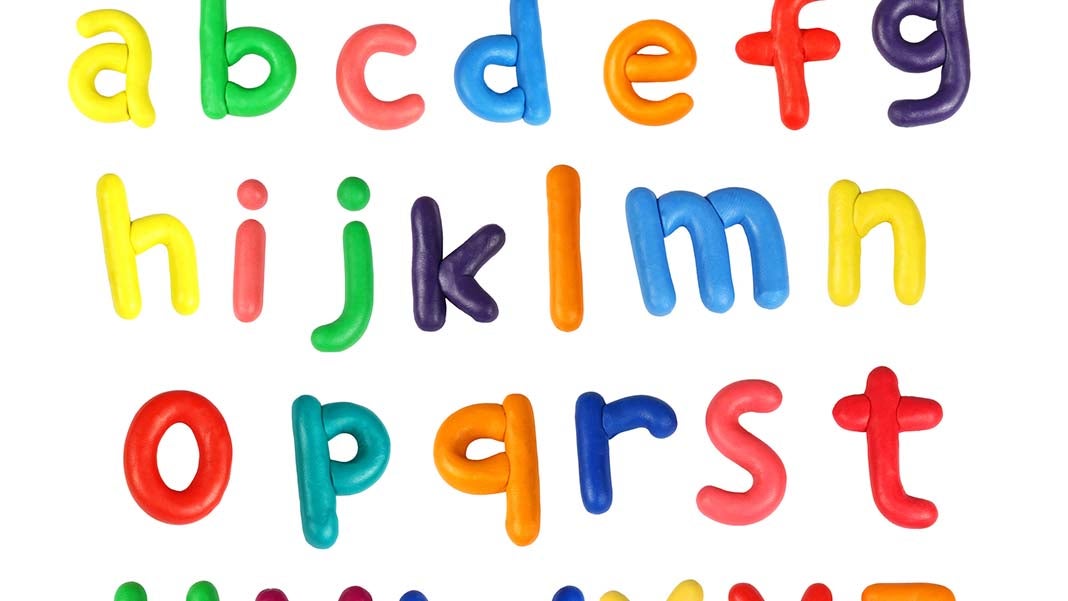
Ever wondered if having your brand name written in lower case on your logo is appropriate?
Logo design can come with a few challenges when it comes to creativity. Often, companies are predisposed to certain design and strategy rules that are more on the traditional side. We recently faced this challenge when a client came to us eager to rebrand their business.
Any marketing team knows there’s a lot more to building your brand name than just colorful scripts and pretty pictures — it’s about building your identity and conveying the right message to the right audience. To do this, clients and designers both need to fully understand who they are and who the target audience is.
Brand Identity Matters
Questionnaires that allow the client to honestly reflect on their identity, creative character and buyer personas help both parties to solidify the client’s brand identity.
After asking our client to answer these questionnaires, we developed a logo design that reflects the brand’s identity, conveys the right message, is memorable and durable.
Despite this, the client expressed a slight concern — the logo was in lower case. “You really knocked it out of the park, it is exactly what we are looking for, but… Shouldn’t the company name start with a capital letter?” The client went on to question why we did this and who else has lowercase first letters in their brand.
Logos in lower case? What were they thinking?
Amazon, ebay, facebook, flicker, intel, citibank, macy’s, bp, vitamin water, and xerox, are brands who switched from first letter capitalization to lower case just to name a few.
There is a trend in this direction. You can find proof from many of the before and after rebrands found on Under Consideration’s Brand New Blog. Some notable ones include JCPenny, Sears, Airtel, Coinstar, Nickeldeon, Xfinity and Mapquest, to name a few.
Logos in lower case exude an approachable and casual vibe, allowing corporations to connect easier with their target market. Despite this increasingly popular trend, there are a number of businesses that do not feel the need to change their logo to fit this trend to channel an approachable persona.
Those of you who are meticulous about writing rules and are cringing at the very thought of this trend, don’t worry. There are still a lot of businesses that follow the traditional rules of language and grammar that will definitely keep a smile on a teacher’s face. Examples include Lipton, Kool-Aid, Coca-Cola, Google, Spotify and even our good friend, the king of inbound marketing, HubSpot.
Nope, they’re not yelling at you.
Now despite the popularity of this trend, it may not be suitable for every brand. Some companies that need to assert a strong, hefty, or massive presence in the market often go with bolded brand names and/or brand names in fully uppercase logos. Take for instance IKEA, BAND-AID, or BEST BUY; understandably, these brands chose brand logos in all caps.
The takeaway from this is that behind every logo design is a strategy. It’s not about the cool fonts, the nice colors, nor the rules of language and grammar. At the end of the day, it’s not a good idea to stick to the staple just because that is what you’re used to in your industry. If you want to stand out, you have to break the mold. Make sure that your decision to do so is backed by a solid strategy and built on your brand identity.
When it comes to capitalization rules, choose what fits your brand identity best. Consumers of today respond to personal touch and character. They are well aware of the choices they have, what they want, and who they want it from.
Failing to make a connection with your target audience is pretty much brand suicide. Don’t shy away from creating pathways towards a closer relationship with your audience.
3480 Views


