Do you ever wonder whether your audiences read your digital content? The content for which you painstakingly brainstorm, research, write, and edit?
Sure, you can track email open and click-through rates, unique and returning website visitors, session duration, bounce rates, and other metrics. But do your audiences really read it?
One way to find out is to use a heatmap or visitor recording tool. According to The Daily Egg:
“A heatmap is a user behavior report that displays visitor activity on a particular web page using a color key. In most cases, warmer colors — like red and yellow — indicate lots of activity, while cooler colors indicate little to no activity.”
Heatmaps tell us where the most activity is, where visitors click on your page and how much. You can also learn where users aren’t clicking so you can use that space for something else.
Visitor recordings of users’ sessions tell us how they interact with a website. You can watch their mouse movements, clicks, and other behaviors that track their customer journey. You’ll also discover where your boo-boos are so you can improve your pages.
Hotjar offers a free-forever plan that tops out at 2,000 pageviews/day. If your site has more pageviews than that, pricing starts at $49/month.
Lucky Orange offers heat map data and recordings for $10/month for up to 25,000 monthly pageviews.
Crazy Egg tracks up to 30,000 pageviews and 100 visitor recordings a month for $24/month.
Mouseflow tracks less than 10,000 pageviews/month for $29/month or if you have 100 pageviews or less, there’s a free-forever plan.
Smartlook has a free plan that includes 1500 pageviews/month. Recordings are not included until you upgrade.
These tools can provide plenty of information. But they can’t tell you why visitors may not be reading your content!
So, I’d like to share my reasons for refusing to read certain digital content. Sure, it’s subjective, but you may find them valuable. You can also use them when you develop your next quantitative marketing research questions.
Reason #1:
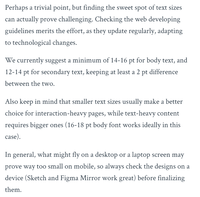
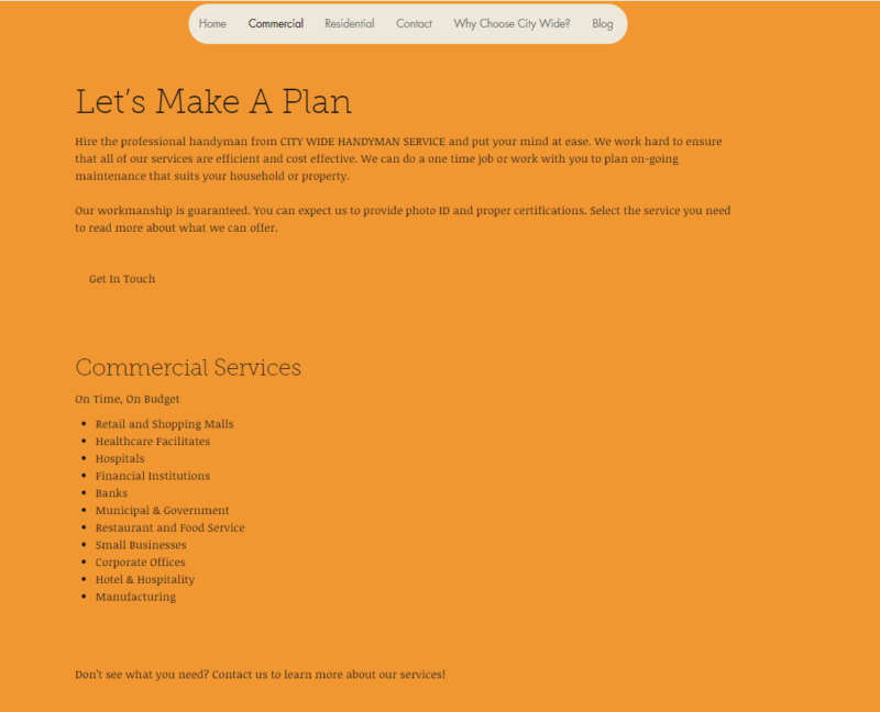
The text size is TOO small! I don’t know about you, but these examples are too difficult to read. If I must squint or pump up my device font settings, forget it. I’m gone.
According to Design Shack:
“If the body copy on your website isn’t at least 16 points, it’s time to rethink your typography situation. This ‘rule’ has roots in mobile since text that’s smaller than that for inputs will actually zoom in on some devices. (This can be annoying in terms of user experience.) The design fix is to create levels of typography that are big enough to read and understand with ease.”
Some website design programs enable you to adjust the font sizes for desktop, tablet, and small mobile screens. This way, you have some influence on the user experience. Of course, users can also adjust their settings to their preferred size, which may change how typography appears.
Isn’t this better?
Reason #2:
The text color is too light! You must be kidding if you think people can read this example!
Reason #3:
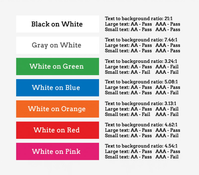
The color contrast between your background and text color makes reading very hard.
According to Envato Tuts+, roughly 9% of the global population have some variant of color blindness, suffer from low vision, or are completely blind. The following chart demonstrates what passes and fails for website color contrast accessibility.
Reason #4:
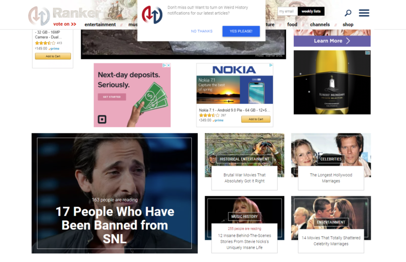
Your page has too many digital ads that break up reading flow, slow your site down, and make your brand appear less credible.
These statistics show Internet users’ opinions on digital ads:
Reason #5:
There’s too much clutter, too many images, and/or not enough white space. According to Quick Sprout:
“Your web design needs space to breathe. Don’t try to fill every inch on the screen with text and images. Empty space can be just as effective. Empty space in your web design will ultimately help direct the visitor’s attention to your focal points. Now they won’t have a problem spotting your value proposition.”
Fewer images will also help increase call-to-action conversions:
Here’s an excellent infographic with helpful tips on creating a great website:
Trending Articles