Google Makes Your Inbox Pinteresting

For the past 12 months, Google has been making a lot of interesting changes that are really shaking up the email space. The latest is the redesign of the Promotions tab to look like a … let’s face: it’s a Pinterest wall. While this is a move to provide a more visually appealing experience for the end user, is the email channel ready for a change of this magnitude? How will it affect all the email-heavy brand marketers whose emails end up in the Promotions tab?


Last 12 Months of Changes
Before we jump into evaluating the current change, let’s do a quick recap of what Gmail has done since last July.
July 2013: Gmail launches Google Tabs. The effect? Email experience on a desktop or Gmail mobile app went from all emails displaying in one window to multiple tabs. The Promotions tab is where most of the emails from brands came to live. The result: brands saw a decline in the click-through and open rates.
December 2013: Image pre-rendering. The effect? All images displayed in your messages automatically. Instead of serving images directly from their original external host servers, Gmail now serves all images through Google’s own secure proxy servers. The result: this started to inflate the open rates.
The New Promotions Tab
Earlier this month, Google rolled out another channel-altering change. Please welcome Pinterest layout to your inbox. This is probably the biggest shakeup in the visual experience of the inbox.
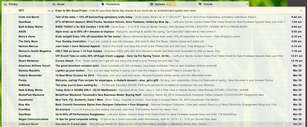
Before:

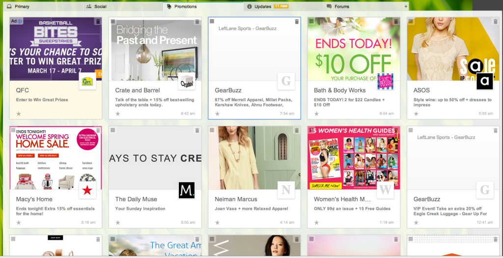
After:

This is a very visual way to display your inbox. Google finally got its wish: It can serve ads in your inbox. The first email conveniently displayed in the top left corner is Google’s sponsored ad email. Your eye naturally goes to this unit because of color and positioning.
If you want to add this to your inbox, sign up here.
What This Means for You as a Marketer
- When you build your email template, make sure you are placing most important images in the top part of the template. Looking at my inbox, the emails that stand out in this layout are the ones with strong images with bright color.
- Make sure your “From” part of the message states the name of your company. This layout highlights who sent the email.
- Remember that your open rates are going to be affected. They probably already went up due to the change in December, but with this rollout, you may see your open rates inflated even further.
What’s Next?
While Google says this is a test, I think this rollout is here to stay. Coming next: marketing messages delivered by drones?
This article was originally published by DigiShopGirl
Published: April 4, 2014
1846 Views
1846 Views


