Industrial websites tend to have a more serious tone and professional look than a cookie factory blog. Because you deal with manufacturing products or providing equipment that must remain reliable, your site needs to elicit confidence from those who visit it. If your design is outdated or doesn’t hit the right notes, then it’s probably time for an upgrade.
Manufacturing contributes to society in more ways than can be measured by the jobs created or the revenue generated. Each position leads to additional roles, and industrial businesses have a much higher multiplier than other sectors in the U.S. economy.
Even though industrial companies are a bit different in the way they operate and what they bring to the table, some of the tips that work for any business website still hold true. At the same time, there are some specific things you should consider that will help you stand out from competitors.
1. Choose the Right Font
Did you know that fonts have personalities? If you choose a script style, your site might look old-fashioned and behind the times. On the other hand, something fun may make it look as though you aren’t serious about your work. You can use a sans serif font for a more modern look, but keep in mind the way the text appears in different screen sizes. Finding the right combination of fonts for your design requires time and experimentation.
2. Use Relevant Photos
A picture creates a story for your website. Some companies make the mistake of using generic stock photos, though. It’s much more impressive if you use highly relevant images of your manufacturing facility or offices. Include snapshots of your employees on the job, zoom in on product components and take pictures of the outside of your building.
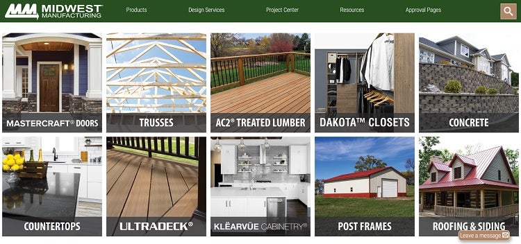
Midwest Manufacturing uses beautiful images of their products in use. You’ll see the doors they make on the front of a beautiful home or their treated lumber placed in a finished deck. Using photographs that highlight finished products shows the pride they put into their work.
3. Pick the Right Colors
Figuring out what colors to use for your industrial website might seem a bit overwhelming at first, but it doesn’t have to be. Some colors are already associated with the industry, ones you’ll see over and over in designs, such as deep blues and soft grays. However, there is nothing that says you have to go with the expected. You can still appear professional with a black, white and red design or any other color — except maybe hot pink.
Think about the colors you already use in your logo and what complements and contrasts those colors best. Once you’ve come up with a palette, it’s easier to build a design and use it consistently across all the places where a customer might encounter your brand.
4. Improve Your Headlines
One of the first things users encounter when searching online is your headline. This text appears in search engine results and should pop on the page when someone lands there. What is the message you want to send with your headline? You have just a few words to get your point across, so you have to put yourself in the shoes of your visitor.
If you were a typical customer, what would you most want to know? Think about the problems your customers have that you can solve, then address that issue in your headline.
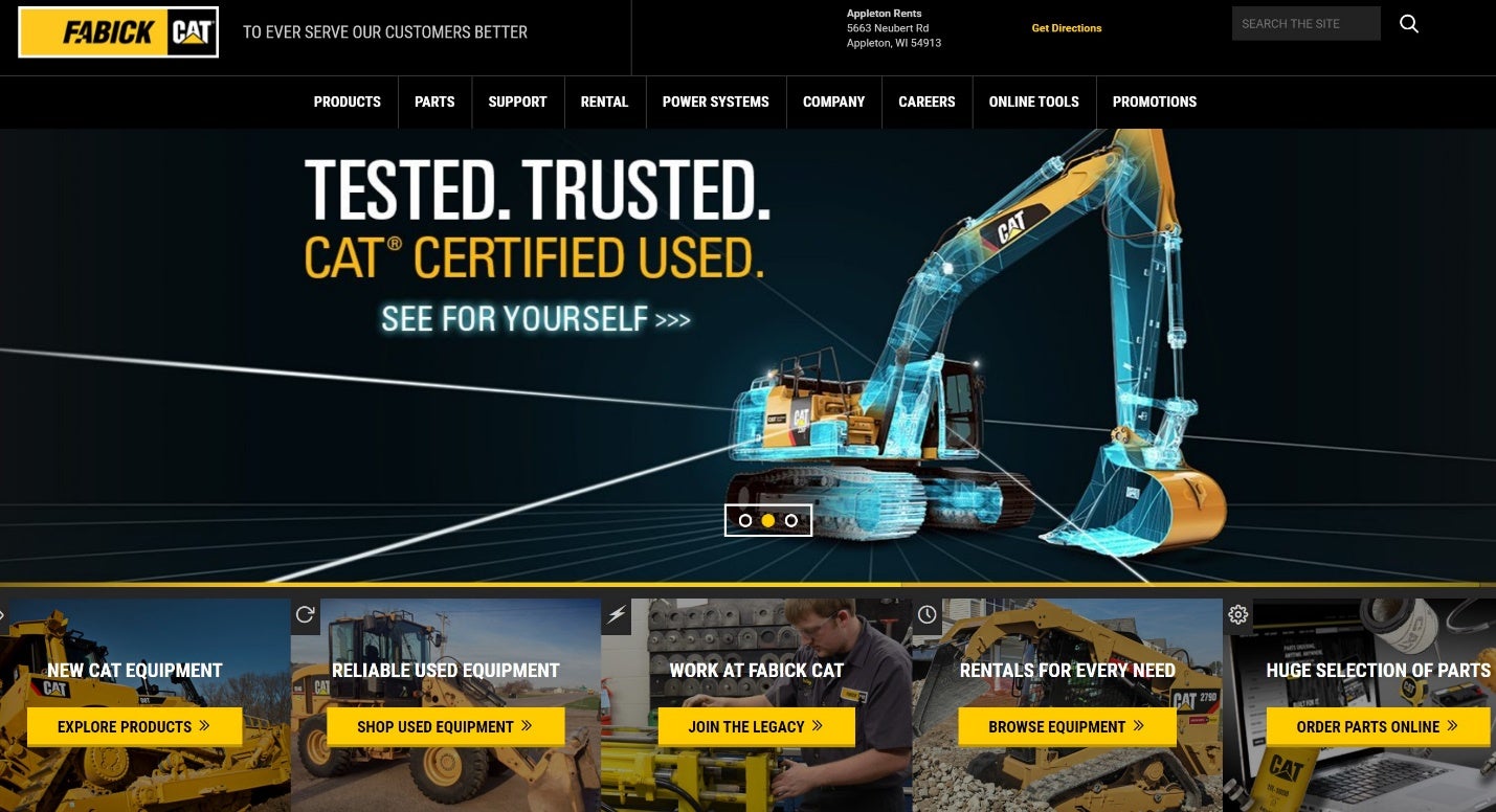
Fabick CAT uses a headline that shows their equipment has been thoroughly vetted and is trusted to run optimally. They also include that the machines are CAT certified. The statement answers a concern some customers have upfront so that they can move into the options they offer. They also include some strong CTAs just under the headline.
5. Run a Competitive Analysis
Perhaps you aren’t quite sure why your site isn’t performing the way you’d wish. Study your competitors’ websites and take note of what you do and don’t like. It’s often much easier to critique someone else’s work. Once you have a list, compare it to your site. You may find there are things you didn’t realize are unnecessary. You will also discover trends and ideas from the other websites you may wish to incorporate into your own.
6. Include Strong CTAs
Your calls-to-action (CTAs) entice visitors to click on a link and learn more. If you want your landing pages to generate leads, then spend time focusing on improving your action buttons. Think about the language you use and if it includes words attractive to your target audience. Does the button contrast the rest of the design? Is it above the fold and large enough to spot easily?
Small tweaks make a big difference when it comes to CTA design. Try different wording, colors and positions, then test them all to see how users respond.
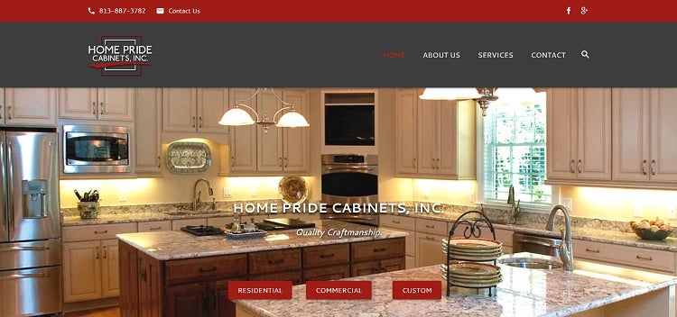
Home Pride Cabinets features simple CTAs that direct site visitors to the type of account they need, such as residential or commercial. Just because you have an industrial website doesn’t mean you don’t need the same level of design as an ecommerce site.
7. List Contact Information
Make your contact information easy to find. It signals to site visitors that you’re trustworthy and, if they have an issue, they’ll be able to get in touch with you. It’s a good idea to place a contact link in your navigation and then include a phone number near the top of your page. You should also add additional options to get in touch further down the page, such as a live chat feature, email or snail mail.
8. Keep What Works
One thing you might not have considered is that some elements of your site may function precisely the way you’d like. Study Google Analytics and heat maps to see how different parts on each page work together to engage visitors.
What links get clicked the most, and why do you think that is? You don’t want to redesign only to lose what’s already working. You only want to change things that don’t serve a purpose.
Redesign Your Industrial Website and Test Like Crazy
Once you’ve finished your redesign, the real work starts. Test the new elements you’ve added and determine if they are performing better. If not, try something different, run more split tests and repeat. The more you test, the better you’ll understand how your target audience responds. With a lot of information and a dash of creativity, your industrial website will be one of the best in your field.
1968 Views

