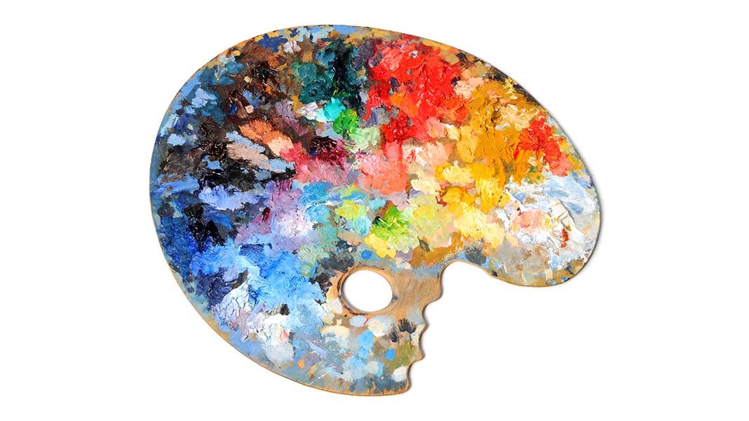
Color psychology may not be a topic you have come across much, neither will you have thought about the impact of colors—until now. When it comes to branding your business, the color or colors you choose for logos and other materials send an important message.
At its most basic, the right color can attract the right people to your brand, not a power you would have thought that color had. But it does. At Colour Graphics, we know how important color is which is why we work closely with all our clients to make sure that the colors are exactly what they want and need.
So what do various colors say about brands?
Colors and emotion
Different colors say different things, inciting various emotions. Although there are no hard and fast rules, or any reason why you should avoid some colors but use others, knowing what emotions colors could inspire in your potential clients is important.
Take a look at this table and then think of logos that mainly display a particular color and ask yourself, what is that brand trying to achieve?
- Red, for example, signifies intensity
- Blue highlights depth and stability
- Yellow denotes energy and joy
- Green, on the other hand, is linked with harmony and natures
- Purple is associated with luxury and royalty
- Orange is associated with happiness and the tropics
- Black signifies formality and mystery
- Pink refers to love and sweetness
- Brown is linked to Mother Earth
The most valuable brands in the world and color
As you would expect, the top 10 brands in the world are dominate by those business in the computing and online world.
Apple takes the top spot, followed closely by Microsoft. The only non-gadget or technical brands in the top 10 are Coca-Cola and McDonalds.
Out of the 10 brands, four have blue as their main brand color, two have opted for black and grey, one has opted for green, another for yellow and there is one red. The remaining brand is Google, using the primary colors red and yellow, with a hint of blue.
You need words
There are only a handful of elite brands that can get away with using their logo on everything, with no words attached, not even their company name. It takes a lot of work and recognition to get this far and so unless you are an established, reputable and famous brands you need some carefully chosen worlds with your logo.
And beware, a decent logo that ‘speaks’ can cost a fair bit of money to create. You may wonder why and this is because a logo is an abstract concept, one that is easily recognizable and tells the story of your brand, service, product and company.
It needs to be something, not just a random act of putting a few shapes together and coloring them in.
Some logos are very costly. And not all of them are a great hit…
The London 2012 Olympics logo was widely criticized as looking like boxes jumping around together. It cost thousands of pounds to conceptualize this piece, which stated it represented a vibrant, thriving city.
But some of the best and most recognized logos cost zero. The re-design of the Microsoft window logo, for example, was created by an in-house design team at Microsoft, saving the company tens of thousands.
Changing your logo – the smallest tweaks make a big difference
If you are looking to re-design your logo to bring it up to 2016, you will be pleased to know that the smallest of changes can have an instant effect. For example, the BBC logo was re-designed some years ago with the only change being that the slant was taken off the letters.
Johnson & Johnson did a similar thing, barely changing their logo when their re-designed it in the 20th Century. It has largely remained untouched since.
Big changes for when there are big changes in your brand
Remember the original Apple logo? It was a rainbow colored apple, complete with stalk and leaf, and a bit out of the apple. The logo still consists of the same iconic apple shape but the colors are now an outline color with a white apple. Risky you may think, but it has changed the way people see this iconic logo, without them misunderstanding who or what it represents.
The importance of a logo cannot be underestimated. You need to choose the right colors that convey the right impression. And remember, some of the best and most iconic logos cost nothing!
Author: Colour Graphics is an online print and design agency, with infinite knowledge and understanding of how colour is a key aspect of any print and design business. Offering the latest in print technology, they can help create a logo that says everything about your business, including the right colours too.
3254 Views


