How to Incorporate Data Visualization on Your Website
By: Eleanor Hecks

Infographics help take complex data and make it more easily digestible. Whether you want to share statistics or you need to explain complicated concepts to your users, data visualization is a must for your business website.
Start by thinking about the results you want from visualization. Once you know the purpose behind adding elements to your page, it becomes easier to figure out how best to use points to draw attention, inform or direct your audience.
A study at Ball State University showed color increased attention span by 82% versus black-and-white visualizations. We already know you can dress up a drab topic by adding images. Utilizing color takes your infographics to the next level.
You may wonder how your company can incorporate data visualization on your business website. There are many opportunities to enhance the information that’s already there. We’ll look at some and check out examples of what others do that work particularly well.
1. Incorporate Photographs
Maybe you’re not great at illustrations but aren’t quite ready to hire a graphic designer to create your visualizations. With white paper, you can easily use photographs and add text with a free online program such as Canva to create an engaging infographic.
You can also add photographs alongside illustrations to add more interest to a drab presentation. Some information is just dry, and anything you can do to spice it up helps.
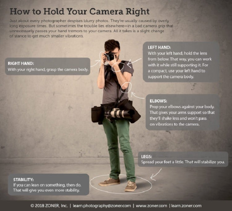
Zoner Photo Studios shows off its expertise with photography by creating a learning center on its website. It uses an image of a photographer holding his camera. Added text shows the elements to keep in mind when using proper posture and positioning.
2. Pull Out Essential Facts
In any piece of content, there are some elements you wish to highlight. You don’t need a page-long infographic to make them stand out. You can add visuals, such as a number in big typography.
Think about the key points on each page. If someone landed on your site, what are the main things you want them to remember? Put those items in images and add them where relevant.
3. Use Geometrics
There is something clean and uncluttered about adding geometric shapes to your design. You can easily place data inside them without changing the overall look of your website.
Use circles, squares, triangles and shapes with straight sides. Think about which ones work best together for an aesthetically pleasing design.
If you’re unsure whether something looks good with the rest of your page, take a step back from your computer screen and see how it looks from a distance. Enlist the help of family, friends and employees, and ask for feedback on any additions. Conduct split testing to see how it resonates with your audience.
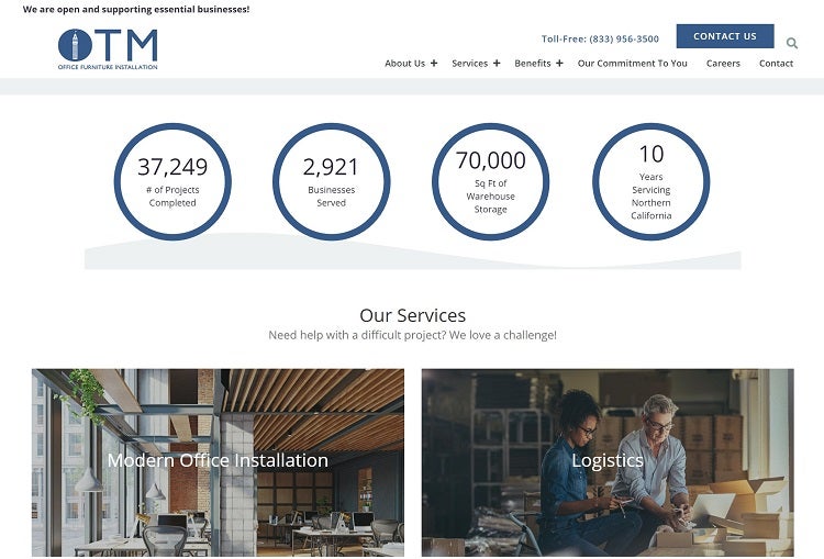
OTM Furniture Installations uses circle outlines to highlight its expertise in the industry. Note how the color matches the rest of the palette on the page. It also has a circle in the logo, which helps the graphics blend with the rest of the design.
In this instance, the circles are on a straight line, equally spaced. You could also use an asymmetrical layout and place them on varying lines or even have them intersect slightly in spots.
4. Remember Mobile Users
Many people access the internet exclusively through their smartphones. Whatever visualizations you add to your site must adapt to different screen sizes. View your page on various mobile devices and see if it translates well. The last thing you want is images that grow too small to view or slide off the screen, forcing the user to scroll.
5. Animate Still Shots
Sometimes a very simple change is all you need to make an impression. Zoom in on a photograph, animate text as you add it or change the focal point slightly. You can grab user attention and direct it where you’d like with simple adjustments.
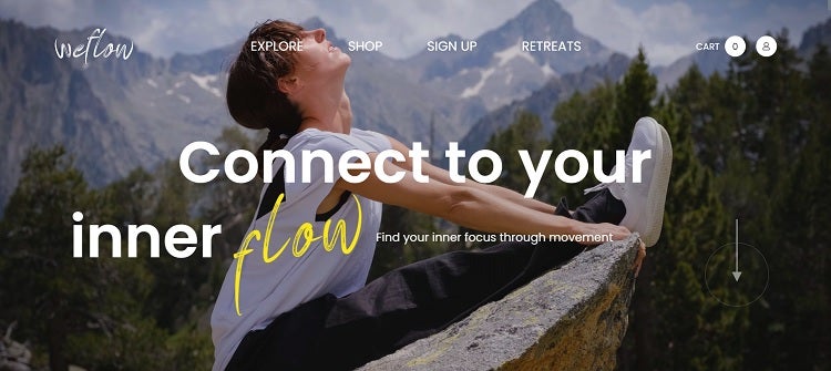
Weflow’s landing page opens with an image of a woman stretching. The angle of the camera shifts as the photograph drops into place. Words appear as though they are being written across the screen.
The site also utilizes animation where the downward arrow directs the user to scroll down the page. There’s an encircled animation to draw attention to the next action it would like site visitors to take.
6. Personalized Content
People are tired of the same cookie-cutter approach. They want your site customized to meet their needs. One example of the use of visuals can be seen by companies such as Amazon.
When you land on the home page, it greets you by name. You then receive images of recommendations based on past buying and browsing history. While the process isn’t perfect and some of the results humorous, it can also be spot on.
Look into automation and technology giving you cookies and the ability to customize your user experience through visuals.
7. Add Video
One of the most powerful visual content additions for your site is video. You can utilize footage to tell a story, share complex information, educate your audience or grab attention.
Videos have the added ability to be noticed on social media and in ads. One video may have multiple uses besides creating interest on your homepage.
Do You Need Data Visualization?
It isn’t a question of whether you need graphics on your business website but where you need them. Study your competitors’ sites. Use common questions to see if there are things you can explain more easily through images. Look for ways to enhance what you already have and create a positive customer experience.
2512 Views
Trending Articles