Increase Your Site’s Conversion Rate with UX and UI Optimization
By: SmallBizClub

Managing or increasing conversion rates is certainly a tricky game. Very often, designers and developers leave this task to the marketers who invest tons for a “social presence” and produce content that doesn’t give them the desired results sometimes.
The problem with this approach is that we’re not contemplating first how we (the designers) could facilitate our revenue targets. The first thing any designer should ever do is point the finger at himself and wonder, “What can I do to convert these visitors into buyers?”
Not so surprisingly, there are plenty of simple and logical ways designers could contribute to the conversions—and of course, they all have to do with the way the website is designed. In more technical terms, your UX and UI optimization can do a lot to increase activity on the page, bring in more traffic, and convert those transient totters into loyal customers.
So, what kind of tweaks can help you achieve this? Let’s take a look…
A Professional Design Conveys Credibility
Before you even think about professional marketing or content development, it’s important to think about how “professional” your web design appears. Your design is what users are going to see first even before they move on to any part of the content. This is why the first impression needs to be an awesome one. A professional design conveys credibility and builds trust. How can you achieve that?
Related Article: How Your Website Design Affects Your Business Success
First of all, keep your design simple. Secondly, make sure your website has a consistent and predictable layout and gives the user as much control over the website as possible. Lastly, aim for high-quality, beautiful displays. That includes high quality images, graphics, content, and other visual and non-visual elements on your website.
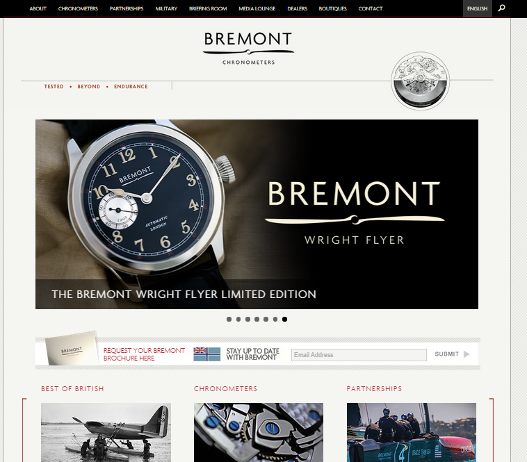
Bremont, the U.K. chronometer brand does just that. The website offers a professional design with a predictable layout and uniformity across the pages. Even though simplicity is the apparent approach here, quality graphics are not comprised in any way. Achieving this level of polish doesn’t happen by accident, or without expertise. Outsourcing the hard work to a UX agency is a good move if you want professional results swiftly.
Design for Conversions
Simply put, you need to have louder than ever call-to-actions. This may seem like a no-brainer, but it can actually be more complicated than you think. The problem with clickable areas and CTAs is that they are often designed on desktop computers where the clickable area seems large enough to easily click on. But remember, the users won’t always access your website using a computer and there’s an even a higher chance of them using a mobile device to get the job done.
With that in mind, it’s crucial to go over your touch points and make sure the areas are large enough for mobile users to tap on. This ensures two things: 1) your users see the CTAs nice and clear even on a mobile device, and 2) it’s a user-friendly, tap-able, and responsive option.
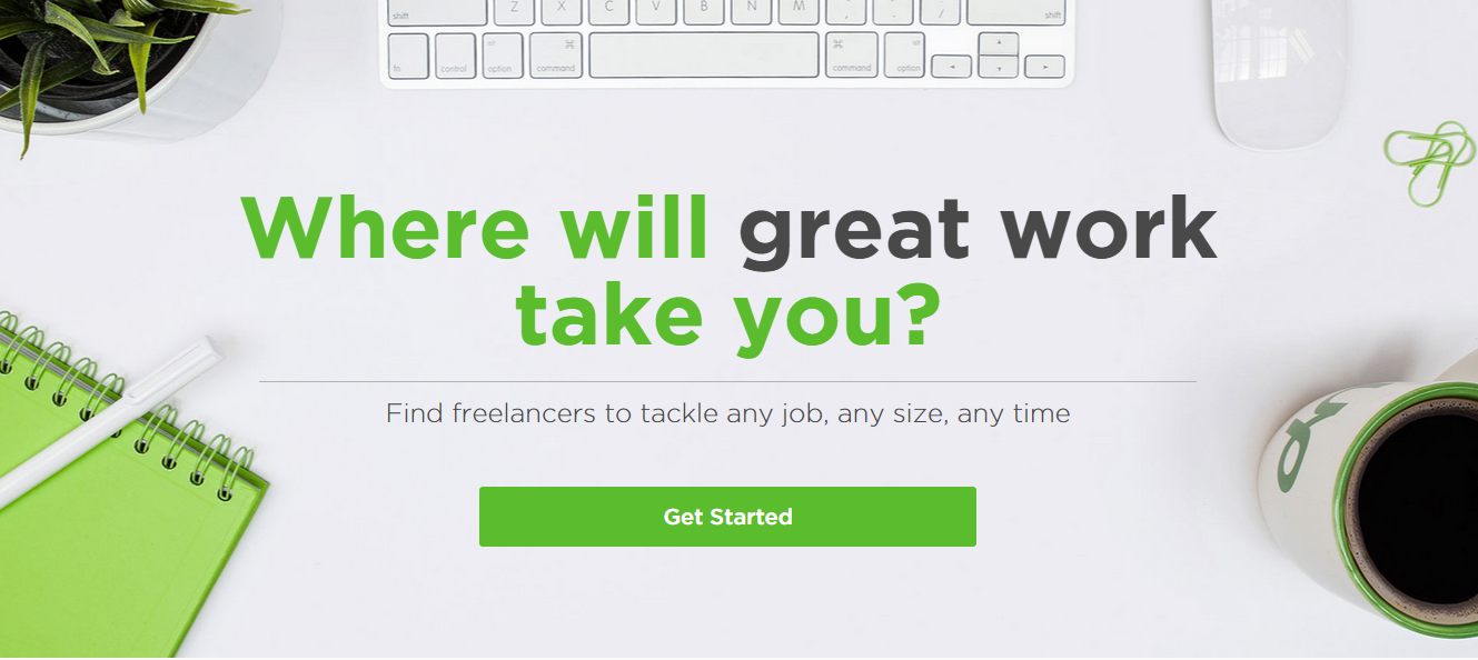
This design was labeled number one on Hubspot as a “Call to Actions You Can’t Help But Click”—and for obvious reasons. With a CTA right in the center on a clutter free back-ground, you can’t help but notice the green “go” button. Highly clickable!
Lead the Way
Here’s a paradox: even though you want your users to have all the control, you’re still going to try and lead the way by delivering the right information at the right time. Your users could be wondering about product-related information, shipping costs, credit card security, purchasing options, or anything else you serve. A good design creates a path for users from start to finish. It answers their question in a clear, concise and step-by-step process. Put yourself in the user’s shoes and answer these questions one-by-one with prominent links and guides.
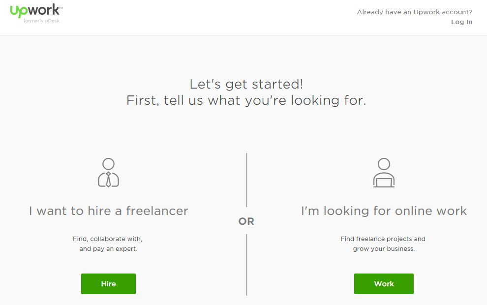
Upwork navigation is pretty simple and straightforward. Once you click on the “Get started” button it leads you to two simple CTA’s. Once that’s set aside, you get to create an account. Even if you’ve made a mistake, it provides smaller links to an option you might have missed. Don’t be obscure. Don’t be modest. Focus on what’s important and make it crystal clear.
Always Run Split-Tests
Experimenting on your UI and UX is an ongoing process in design. What could have worked before because it was “trending” may be a dated concept now. For example, sliders were (and may still be) quite trendy. Recently, experts are advising against fast moving carousels because they detract focus, are difficult to navigate, and not suited for every target audience. Alternatively, it could work well for your website if you’re using it to display high-quality stock photography at a quick pace. Whichever the case, you need to keep asking questions and testing out your elements whether it be a headline, layout, button, color, or a new animation. Google Analytics and KISSmetrics, are few examples of popular tools you could use.
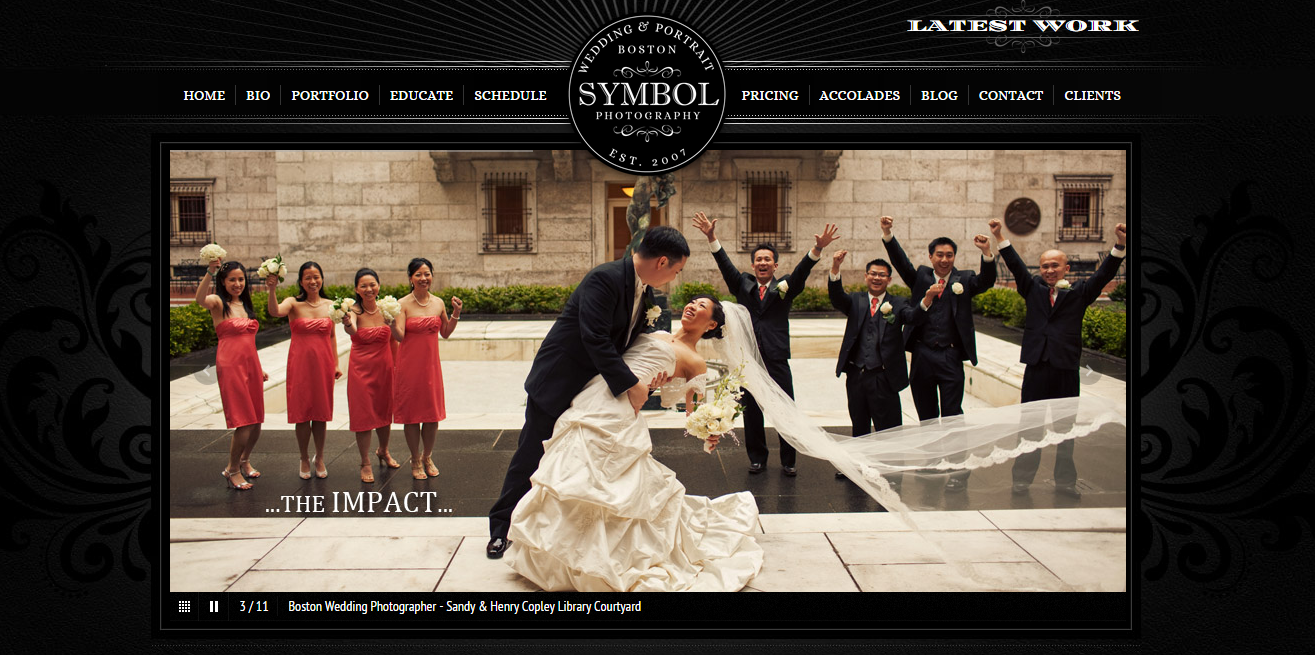
A slider is perfect for symbol photography’s homepage, a Boston-based wedding photographer. It definitely adds value to the brand since it displays the best part of their work (photography), doesn’t take too long to load, and doesn’t require users to read off of it quickly. Perfectly optimized!
 Author: Usman Anwar is a senior web designer at Logo Gulf, a logo design Dubai firm. He is a marketing graduate with certifications in designing and development. He also works as a freelancer. You can follow him on Twitter.
3259 Views
Trending Articles