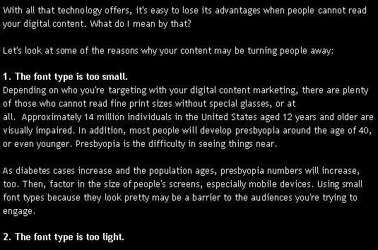
With all that technology offers, it’s easy to lose its advantages when people cannot read your digital content. What do I mean by that? Let’s look at some of the reasons why your content may be turning people away:
1. The font type is too small
Depending on who you’re targeting with your digital content marketing, there are plenty of those who cannot read fine print sizes without special glasses, or at all. Approximately 14 million individuals in the United States aged 12 years and older are visually impaired. In addition, most people will develop presbyopia around the age of 40, or even younger. Presbyopia is the difficulty in seeing things near.
As diabetes cases increase and the population ages, presbyopia numbers will increase, too. Then, factor in the size of people’s screens, especially mobile devices. Using small font types because they look pretty may be a barrier to the audiences you’re trying to engage.
2. The font type is too light
You’ve probably seen Web sites and blogs that use a light gray font on a white background. Look at this example and see if it’s difficult to read. What do YOU think?
3. There’s a lot of white reverse font on a dark background
Another challenging content design flaw is reading white reverse font on a dark background. It may be OK for short content, but not OK for an entire page of it. Here’s what it looks like:
4. The paragraphs are too long
Most Internet readers will browse or skim your online content. You can make it easier for them when you break up paragraphs with sub-headers and use bullet points or other visual tools.
5. The content is poorly written
Nothing will send visitors packing more than poorly written content. I am such a stickler for proper grammar and spelling. If you’re trying to attract new people, make sure you proofread everything!
It’s also a good idea to have someone else read your draft before you publish it. Sometimes what you write makes perfect sense to you, but may be confusing to others.
6. The reading level is too high
Another thing to watch is the reading level of your content. If it sounds like an academic paper, that’s fine if you’re an academic, but not for organization or business content marketing. You can check the reading level using Microsoft Word. Here are the instructions:
- Click the File tab, and then click Options.
- Click Proofing.
- Under When correcting spelling and grammar in Word, make sure the Check grammar with spelling check box is selected.
- Select Show readability statistics.
After you enable this feature, open a file that you want to check, and check the spelling. When Word finishes checking the spelling and grammar, it displays information about the reading level of the document.
Look at the Flesch-Kincaid Grade Level. A score of about 65 correlates with the 8th to 9th grade level, and a score of about 55 indicates a 10th to 12th grade level. Scores between 0 and 30 represent college graduate readability.
7. There’s not enough white space
If there’s not enough white space, readers may find your content challenging to read. It appears crowded and may make readers uncomfortable and claustrophobic.
So, there you have it. These 7 reasons are easy to fix and can make a difference in making your content appealing. Why turn them away if you don’t have to? (Yes, I ended a sentence with a preposition. Tsk, tsk.)
This article was originally published by Elaine Fogel
Published: July 29, 2013
3059 Views
3059 Views
Trending Articles

Stay up to date with