Data is powerful. We’re all enamored with analytics and what they can tell us about our customers and our business. But data can also be very dangerous if we really don’t understand it. If we only look at it on a surface level, never drilling down to understand it, we can draw dangerously wrong conclusions.

We’re all familiar with the Pareto Principle. Somehow, it seems virtually every piece of analysis fits the Pareto Principle (or almost). 80% of our revenue is generated by 20% of our sales people. 80% of our revenue comes from 20% of our customers, 80% of our revenue comes from our top products, 80% of our revenue comes from our top N customers, and on and on.
The examples go on. Look at it, the math works in all those cases. But looks can be deceiving. We can’t just stop there, we have to drill down, analyze the data, understanding what it really means. Often, the results are frightening (actually virtually every time we do the analysis), and the conclusions are dramatically different from what the simple 80/20 view might indicate.
Let’s take a simple case study. It’s an analysis we’ve done hundreds of times, and we see virtually the same outcomes every time. Here’s the premise:
“80% of our revenue comes from our top N customers.” N varies, we’ve seen top 50, top 100, top 1000. Usually the statement is made with some sort of pride, usually as they talk about their major account programs.
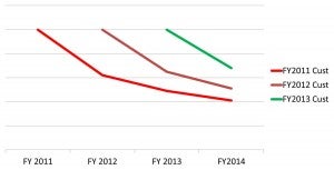
So, I make a simple request. “Give me the data on the purchases of all your customers for the past Y years.” Usually, I ask for 5, but I take whatever data I can get. The analysis always looks something like the chart below:

Virtually every time, we see hockey sticks—only all going in the wrong direction. Their observation is right: 80% (or 70 or whatever—it’s the majority) of the revenue comes from the top N customers.
But as this chart shows, every year it’s a different set of N customers. Virtually every time we do the analysis, we see significant customer churn. Of the top N customers in one year, after about 2 years, 60-80% of those customers are no longer in the top N. (This particular example is one of the better one’s we’ve seen, usually customer churn is much higher).
And, as this chart shows, we see the same patterns year after year after year. This presents a different challenge than one might think of when one doesn’t dive into the data. In this case, people think they are doing well with their top customers. In reality, since it’s a different set of top customers every year, they have completely the opposite problem.
They have a huge customer retention/churn problem. Sure, in some types of products, for example major capital equipment expenditures, the customer may not have to buy every year, but we can account for those buying patterns in the analysis.
So data can be very powerful and very misleading. We always have to dive in to understand what the data really means. Conclusions based on surface analysis (and virtually every time I see someone citing the Pareto Principle) can be very misleading. To make data useful, avoid jumping to conclusions based only on surface data, drill down and really understand what you are looking at.
For those of you interested in customer retention/churn (from this particular example): It’s always interesting to look at those past top customers who are no longer top customers. We go ask them, “Why?”
You might guess the answers: “We were unhappy with the product!” “Customer service sucked!” “The price was too high” “We found a better alternative.” The list goes on.
But there’s one result we always see. Generally, 30-42% of the responses are: “We forgot to.” Drill into these responses, and you find people who were very happy with the past relationship and would have bought again. But somehow, they’d lost contact with the sales person, they’d been contacted by a competitive sales person or received a piece of communication from them, or they weren’t receiving regular communications from the company (Think: What are you doing in nurturing and maintaining communication with your existing and past customers?).
Data and analytics are very powerful, when used correctly. It needn’t be fancy stuff. The analysis we cited above can be done very easily. But properly done, it can give tremendous insight into your customers and your own operations.
When you hear someone saying, “80% of something produces something…..,” hold onto your wallet. The math works, but drill down to really understand it.
Feel free to call to learn some simple analytics you can run to get tremendous insight on your organization’s performance. We’d love to help. People are always surprised by what they learn.
This article was originally published by Partners in Excellence
Published: February 6, 2014
2329 Views
2329 Views


