Update Your Website with These 7 Easy Design Trends
By: Elaine Fogel

Websites can easily become stale and dated. I know. I just updated our agency’s site to better reflect current trends. (When you’re busy working on client projects, it’s challenging to look after your own.)
According to a recruitment website design company, for small and mid-sized organizations that don’t always have the budget for fancy and customized bells and whistles, my motto is KISS (Keep it simple, stupid.)
The marketing objective is to attract and engage visitors and guide them to calls to action. No design awards required.
Read more on branding and website design.
Before I tackled the project, I laid out my goals:
- Make it cleaner and less cluttered with lots of white space.
- Make the menu navigation simpler with fewer drop-downs.
- Ensure there’s a good mix of copy, images, videos, and embedded Slide Shares.
- Revise the lead call to action to make it more relevant.
- Simplify the footer.
- Ensure the user experience is easy and smooth.
I also researched award-winning websites and read what some designers say are the current trends. Naturally, it’s a subjective matter, but some commonalities do exist. Here’s what I discovered:
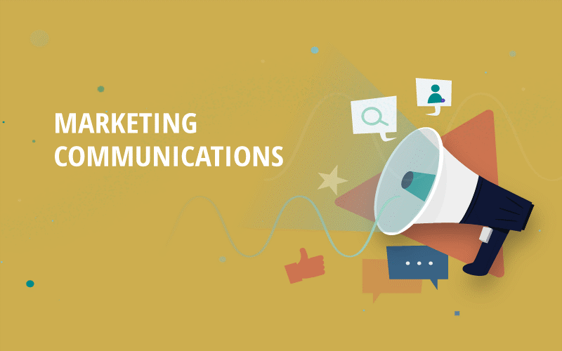
1. Vector Illustrations
According to the Next Web, “While illustrations have been prevalent on websites for many years, there’s a growing trend of having custom, detailed, and well-executed illustrations grace websites recently, and I’m sure this is a trend that is just getting started.”
Eshley Jackson, in a DesignHill article adds:
“Use of illustration and graphics is another web design trend that the website designers are preferring for its use as an effective visual tool to communicate a brand message. Unlike stock photography, illustrations can be tailored to suit to the tone of a company. This helps a brand stand out in a marketplace. If you imagine how future website designs will look like, include custom illustration as a trend.”
Here’s an example of a vector illustration I customized and converted to an image file:
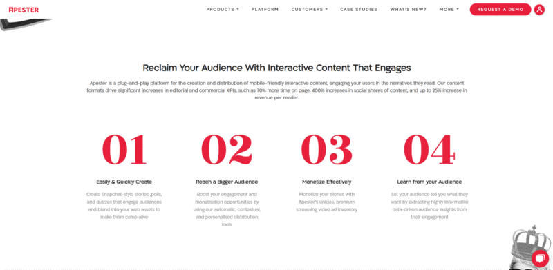
2. Whitespace
According to Sylvia Foerster in a recent Business2Community article,
“Having a lot of whitespace throughout your site is not necessarily a new trend, but it will be used more and more, especially in tandem with minimalistic designs. Whitespace or negative space refers to the empty areas around design elements like text or images. Just because it’s called ‘whitespace’ doesn’t mean it’s only white—it can be made up of any background color. The empty space between columns, margins, and lines of text is also considered whitespace.”
Moses Kim at UX Planet agrees.
“When elements fight for attention, none of them is getting enough. When there is a spotlight on one element, it gets all the attention. Depending on the message the UI is delivering, it’s important to give it some space, to let that message sink.”
Here’s a good example from Apester:
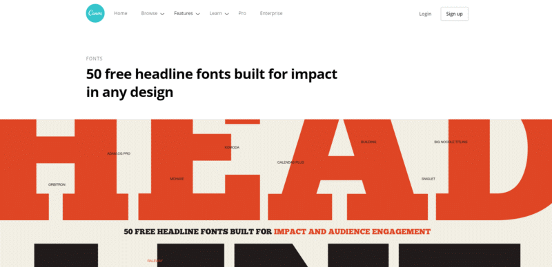
3. Bold Typography
When you want your headlines and calls to action to stand out, use bold typography. The trend to use heavy, large typography is certainly catching on.
Elementor, one of the top WordPress page builders, suggests that heavy fonts put more visual weight to the message and direct the reader to where they should look first. From an aesthetic point of view, bold fonts also give designs a modern and contemporary feel.
“Bold typography can be a little overwhelming when there’s a lot of it to read. If everything is bold, then nothing is bold. That’s why you should try to use these bold fonts only for short pieces of text or headers/subheaders.
Don’t forget about the contrast—a heavy font will have more impact when contrasted against a neutral background.
Use simple fonts. When it comes to text elements, the first thought should always be readability. It’s recommended to use Sans Serif fonts because they scale well. Also, when picking a bold sans-serif font, look for letters with round shape.”
Not only does this page from Canva demonstrate a large headline, it also provides fonts you can use.
4. Animation
Animation is website content that moves rather than remaining static. It can increase your visitors’ level of interest and interaction and keep them engaged to stay longer,
“Animation is an important design tool for both UX and brand messaging. Just like typography and color, the animation you use says something about your product and its personality,” says Val Head, a senior design advocate at Adobe, author, and web animation expert.
It’s wise not to use animation frivolously. Some options are simply tacky and will not convey your brand effectively.
Here’s a creative example:

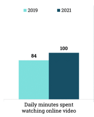
5. Video Integration
If you want a modern, up-to-date site, it’s important that it includes videos. Even low-budget organizations can create simple videos using online tools.
Why video? People love watching them. According to an article and graph on MarketingCharts, online video viewing is growing.
“If you aren’t using video in website design projects already, this is the year it will probably happen. Video content is huge. And it’s becoming more accessible all the time… this type of storytelling is the wave of the future. Users like it. There’s no denying that. And for that reason, it will just keep growing in popularity,” says an article by Carrie Cousins in Design Shack.
Credit: Oberlo.com
6. Bigger Images
It’s not uncommon to see large hero images on website home pages. According to Wikipedia, hero images refer to a large web banner image, prominently placed on a web page, generally in the front and center.
The trend, in general, is to use larger images where you want to make an impact. Just remember to compress them so they don’t slow down your site and review how they appear on mobile screens.
Here’s an example of a hero image on the Marriott Bonvoy site:
7. Business Strategy-Based Design
This one is so important. The purpose of a website is to market and inform – to reach your strategic objectives. If the design doesn’t take the business strategy into account, what’s the point?
According to an article in Stratabeat’s blog, “Web design, when focused on strategy, can have a massive impact on business growth, and correspondingly more businesses are now realizing the business impact of effective web design.”
This builds a good case for testing and tracking results. Your website analytics give you all the data you need to determine what’s working and what’s not.
Web design trends, like most other trends, evolve and change. What’s “in” now may not be in a year. Staying on top of these trends, and tweaking your site accordingly, can help keep it fresh and current.
Trending Articles