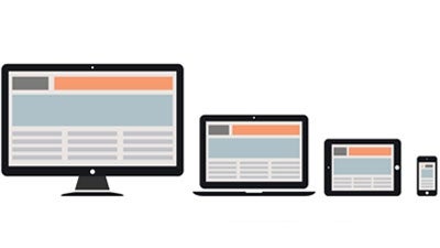
Today, there are more mobile and tablet users on the Internet than ever before. Since most users are now accessing the web from multiple devices, it has never been more important to optimize your website’s design for the many different screen sizes that exist today. The most obvious and effective way to optimize for multiple devices is to switch to a website built with Responsive Design.
Responsive Web Design (RWD) is “an approach to web design aimed at crafting sites to provide an optimal viewing experience—easy reading and navigation with a minimum of resizing, panning, and scrolling—across a wide range of devices (from desktop monitors to mobile phones to tablets),” according to Wikipedia.
Related Article: The Future of Web Design: Responsive?
As mobile and tablet usage continues to increase, users are beginning to expect a fluid and navigable web experience, no matter which device they are using to browse. At this point, not switching to RWD or developing a separate mobile website may end up causing a lot of problems for your users. Below are four common user problems that making the switch to RWD will likely be able to solve.
Smartphone users who visit my website complain that my website is difficult to navigate because they have to pinch and zoom to do anything.
This is an indication that your website is not optimized for mobile. If your website’s visitors are forced to pinch and zoom in order to navigate through your website, you most likely only have a desktop website set up. While building a separate mobile website is one solution to this problem, it might also be completely unnecessary, depending on the intended functions of the website you’re building.
Unless your website has a heavy ecommerce element, RWD is the best way to solve the multi-device optimization conundrum. A RWD websites only requires one set of code and automatically adjusts and adapts to the size of the device’s screen being used to view it.
So, if your users are complaining about your lack of mobile optimization, then RWD is a one-step fix that will optimize your website for all devices—past, present, and future.
I’ve noticed that my sales and conversion rates are slumping.
If you want to increase your conversion and sales rates, try switching to a responsive design. Your rates might be slumping if your website has a poor user experience. It might have a poor user experience as a result of not being optimized for mobile and tablet users.
RWD offers a simple yet effective way of removing some of the obstacles a typical mobile or tablet user may be encountering while visiting your website. A consistent user experience will have a positive impact on your conversation rates because users will be comfortable with using your website and won’t become confused or annoyed by an unfriendly design.
I’m having trouble tracking analytics because I have two websites.
RWD websites only require one set of code, which allows you to consolidate your analytics and reporting. No longer will you have to track user journeys, conversion paths, and redirections through multiple websites. Instead, all of your tracking and analytics will be consolidated into a single report, which makes monitoring and analysis much easier for you.
I want to create a separate mobile website, but it seems too expensive to be logical.
Luckily, creating an RWD website will save you both time and money when it comes to mobile development. Before RWD, creating an additional mobile site was the traditional approach, however, it is no longer the only way to optimize for multiple devices.
In addition, you won’t have to worry about managing or maintaining a second mobile website. An RWD website gives you much less content to manage through a single administrative interface.
Since mobile and tablet users are beginning to dominate the market, it has never been more crucial to optimize for all devices and screen sizes—not just for desktop computer monitors.
Avoiding this optimization will cause you more headaches as time progresses. Consider the four problems listed in this blog to be some of the most common and basic challenges that arise from avoiding mobile and tablet optimization. The most cost-effective and simple way to solve these problems is to switch to a website with responsive design.
This article was originally published by SyneCore
Published: March 11, 2015
3025 Views
3025 Views


