Website visitors today have seen nearly every feature you can think of. They watch the latest videos, know the trends in design and are quite savvy about user experience (UX). Even though they may have seen hover effects before, adding this element to your business-to-consumer (B2C) website still makes a positive impact and keeps the user engaged.
The top 46% of e-commerce sites don’t display enough information and would benefit from hover features, according to a recent survey. Most website developers have never thought to use hover to trigger a pop-up with additional information about products. Yet, this is just one way in which hover features could help increase your conversions and meet user needs. If you want to learn more ways to use mouse-overs on your website, here are 12 hover features that might benefit your B2C site in the coming year:
1. Change Colors on Category Options
Your navigation bar is like your website’s brain, mapping where the buyer might go once they land on your page. Most users understand the navigation will be near the top of the page and appear on any page they land on. They can easily find their way back to whatever page they need using this feature.
Adding something as simple as a navigation bar that changes color when the user mouses over one of the categories adds a new level of interactivity and allows visitors to see what exact action they’re about to take before they take it.
2. Reveal an Image
Want to show your target audience who you are and who makes up your team? You have an opportunity to add a cool hover effect that lets the user get to know the people behind your brand. Write the names of your employees on your “About Us” page, and insert images that reveal themselves when a user hovers over each name. You could also insert employees’ photos and add a second picture or their job description that appears when the visitor hovers over the image.
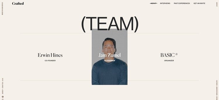
Crafted is a collaboration of artists, and their website is equally artistic. Hover over any of the elements throughout their site, and watch the words morph into images. When you mouse over the staff names on their “About” page, a picture of the employee appears.
3. Activate Animations
You can also use extended hovers to activate animations on your website, trigger a video or otherwise start some type of action. The key is to time the hover correctly. Someone who pauses over a word for long seconds is likely thinking about whether they’d like to click on the link, so it makes sense to entice them further to do so. On the other hand, if they skim past the element quickly, they may not be interested.
4. Highlight Calls to Action
Want to be sure your site visitors know what action to take next? Highlight your CTA buttons by making them change color or adding some other visual effect when the user hovers over them. Think about what will pull your users’ attention to that area. You want them to know their movement has an impact and that, if they click on the element, they will see further action.

Dragonetti Tree Removal has several hover features that work particularly well. First, the two CTA buttons at the top right of the page both transform from dark green with white letters to white with dark green text when a user moves the mouse over them. This visual display invites the user to click on them. The location button is also animated to gather visual interest. When you hover over the location icon, their address pops up.
5. Flip Images
Another idea for using hover features in your designs is creating a flip-book feature. This approach works particularly well if you’re selling clothing or sporting equipment.
For example, one image might show a model wearing a fall coat. When the user hovers over it, the model adjusts their stance slightly—making the photo come to life and grabbing user attention. Since most photographers naturally take multiple shots of the same setup with a model performing different poses, you should easily be able to find two images that will work for this purpose.
6. Expand on Product Photos
Does your product look different after it’s used than when a user receives it? If so, try adding a hover effect that shows the product in use or after use rather than in its perfect packaging. Examples might include bath products or skincare.
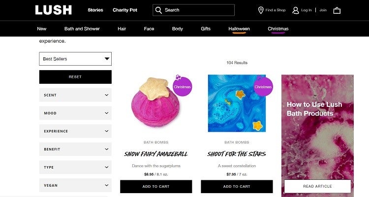
Lush uses hover effects quite often on their site. Many of their CTA buttons are ghost buttons that change colors from black to white. However, what particularly grabs users’ interest is how they display their bath bombs. They show the full bomb as it appears when you order it, as well as a photo of the bath bomb in a tub of water that appears when you hover over that image. The image shows how the water will look once you add the bath bomb.
7. Create a Fun Game
If your site’s tone is lighthearted and fun, you can use mouse-overs to create a fun game where parts move or morph into something else. Adding a game-like element keeps users on your page longer, which gives you a chance to engage them and keep them from bouncing away.
8. Add Underlining
As users navigate through your site, they may get distracted. However a hover effect on your navigation bar that shows where they are can help with any distraction. For example, you might add an underline when the user hovers over the text. Of course, you can always use the trusted color-changing technique, but an added underline allows the page’s appearance to remain the same and gives the letters added importance.
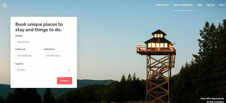
Airbnb does a particularly excellent job of adding some subtle hover effects. Note how text links become underlined when you mouse over them, such as the words “Over 300 unique places to stay in Oregon.” Underlines during mouse-overs also show where you’re hovering in the navigation bar—enticing you to click on the different links.
9. Swap Background Color
A color background hover effect is another technique that makes your website more interactive. If your site is set up on grids, this type of hover works particularly well. For example, as the user moves over the area, the background shifts subtly from a dark blue to a deep purple. The shift can highlight additional text or images or enhance what’s already there.
10. Transition in a Border
Want to draw attention to images as a person hovers over them? Perhaps you want to highlight new products, for example. Add a hover effect that makes a border appear or change colors when the user moves over an image. This feature highlights the photo and encourages the user to click on it to go to another part of your website or gather additional information.
11. Overlay a Color
Many designers have noted a recent push toward transparency. You might see an image on a website with a partially transparent color layered over the top. The color changes the look of the images and makes it striking. You can use this as a hover effect, too, adding transparent color when the user hovers over the photo.
12. Create Animation
You can also use hover to create an animation effect on your site without using actual animation. When the user hovers over a black and white image of a giraffe, for example, the colors might suddenly morph into yellows and tans. The effect makes it look as though the image is transitioning through time.
Pros and Cons of Hovers
Using a hover effect on your website comes with both pros and cons. Mobile devices may not be able to effectively utilize the features—and, if used too frequently, they can hide other information. However, they are still a trendy way to engage site visitors and add some interest to your website. As with most design trends, use mouse-overs with moderation to improve the user experience.
4849 Views
Trending Articles