As a marketer, a good landing page can mean the difference between success and failure. It’s your first (and potentially last) chance to make a positive impression on potential customers and convince them to purchase your product or service. So, with so much riding on your landing page, why wouldn’t you do anything and everything to make yours as good as it can be? Well, TheMail is here to help—here are our top five tips to help you make your landing page the best it can be.
- Avoid Visual Clutter. Often times, visual clutter is the easiest and fastest way to deter potential customers. Too many images or large text boxes can be distracting and as soon as your visitors start to feel even the slightest bit overwhelmed, they will leave your page. Keep it simple—use only images that are necessary to your offer and that enhance your page rather than overpower it.
- Use Your Logo/Branding. You want your visitors to know where they are, right? If they don’t know where they are, they’re unlikely to return. Keep visitors coming back by placing your logo noticeably on your page, and large enough so that users will recognize it the next time they see it. Usually the top left or top center are the best places to stamp your logo.
- Formatting Is Important. Clearly marked headlines, images, and copy will help make your page look clean and organized, and invite visitors to spend more time on your page, and ultimately encourage higher conversion. When developing your page, keep the formatting consistent and strategic. People want to look at pages that are clearly delineated and well organized—good formatting will help you do that.
- Be Clear & Concise. Get to the point! Customers don’t want to spend a lot of time researching your product or service. Tell visitors exactly what they need to know, and nothing more—this should help you keep your copy short and convincing.
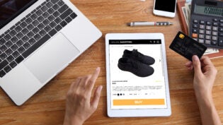
- Use Contrasting Colors. Your main call to action should be the focus of your page—you want to grab visitors’ attention and draw them down the sales funnel. By using a color that’s bright and that contrasts with the rest of your page, you will be able to get customers to focus on your call to action and bring them closer to conversion.
These are our top five tips for now, and should help you create an attention-grabbing, high-converting landing page that will make you some money. However, if you don’t have the technical know-how to create a page for yourself, there are services out there that specialize in landing page and website design.
If you have more tips for designing great landing pages, feel free to leave them in the comments—we’d love to hear your thoughts.
This article was originally published by The Mail
Published: July 11, 2013
3322 Views
3322 Views
Trending Articles

Stay up to date with