Having a sales force is pretty great. The thing about salesmen, though, is that when 5 o’clock rolls around, they punch out and go home. A strong landing page doesn’t have those pesky human restrictions.
An ideal landing page will simply keep on working. It’ll do its job day and night, rain or shine.
The job of a landing page, in case you were wondering, is to do just one simple thing: sell your product or service.
An “always on” sales machine sounds almost too good to be true. Lucky for you, it’s not.
But in order to enjoy the smorgasbord of benefits that you’re probably already drooling over, you’re going to need a killer landing page design.
That’s where this article comes in. We’ll teach you how to make sure your page is up to snuff and you don’t end up unknowingly wasting such a golden opportunity to convert traffic into sales.
Keeping It Simple: The Basics of Landing Page Design
For starters, just in case it wasn’t entirely clear:
Landing pages are there to persuade and motivate—in short, they are there to sell! In this respect, a landing page is the tool you use to convert traffic into customers.
How a landing page works does not necessarily fall under the jurisdiction of your SEO agency. If possible, you’ll want them involved, but in an ideal world you’ll also want marketers to be writing your copy and designers to work on the layout and aesthetic appearance of the page.
Experience is worth a lot here. Years of working on (and analyzing data from) landing pages teaches designers and marketers what works and what doesn’t.
Digging into the nitty gritty of that will be a story for another day. I could write about it for hours!
We also don’t all have the resources to hire multiple people to work on projects like creating landing pages. So we’ll dig further into how you can do it yourself.
Let’s look at some of the key elements a strong landing page will incorporate.
A Great Headline
This is no different from writing copy for articles. You want something that will immediately grab a visitor’s attention.
Think big. Think bold. Think clearly.
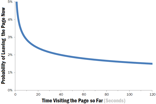
Mediocrity won’t suffice here. People have very short attention spans. This phenomenon is only heightened on the internet, where it’s been shown in studies that you’ll have only seconds to capture a visitor’s attention.
Let that simmer in your brain. See why it’s so important to have a great headline?
Big and exciting text (or an image) is the first thing that a visitor’s eyes will be drawn to, so don’t slack when it comes to experimenting with your headlines.
An Evocative Secondary Headline
This is where you can get a little more specific about what your product or service brings to the table.
You don’t want to be vague or uninteresting here. People searching online usually know what they’re looking for. Beating around the bush simply frustrates the average web surfer.
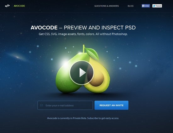
This is a great example of straight-forward and bold headline writing. The words detail the benefits and features, and clearly state the purpose of the website.
Don’t get me wrong, there’s a time and place for intrigue. But use it sparingly. And more specifically, shy away from employing it in your headline and secondary headline copy.
A Click-Worthy CTA
Think you can handle the truth? A good CTA will frequently be the difference between a bounce and a conversion. The importance of leading visitors and making it clear what you want them to do simply can’t be overstated.
There’s powerful psychology at work here as well. If you feel like having your mind blown, check out what Jeremy Smith wrote about it at Kissmetrics.
I could go on for hours about the anatomy of a strong CTA, but in the effort of saving time I’ll refer you to this fun and informative guide by Megan Marrs.
Let’s move on now to some more broad and conceptual elements of landing page design best practices.
Landing Page Copy That Seals the Deal
If you’re a blogger, you’ve got a leg up here.
The style of blogging that has worked best over the past few years, is similar to the style of copy that converts best on landing pages.
Focus on
- Bullet lists (see what I did there?)
- Simple words
- Benefits > Features
- Scannable content
- Your Target Keywords
As you can see, writing your landing page copy isn’t going to be a simple undertaking.
There are a lot of different factors to keep in mind if you want to be effective. Don’t worry though, the more you do it, the better you’ll get.
You can also always edit later on. There’s no harm in realizing you forgot to break up your paragraphs: simply make the change and click publish. All done!
Remembering to Be “Above the Fold”
Know how people have an awfully hard time finding hidden things? Hell, sometimes they can’t even see what’s right in front of them.
For that reason if no other, you want to make sure that your most important content (and your CTA) are glaringly obvious. You don’t want visitors to have to go looking for an opportunity to convert.
Instead, guide them further into your funnel.
The focus here is to keep all of that good stuff “above the fold.” That means that they shouldn’t have to scroll in order to see any of it.
Now yes it’s true that people have learned to scroll. Here’s a fun example. But I’m afraid that while the presentation is persuasive, the basis for that argument is entirely subjective.
Data from one study showed pretty clearly that people spend most of their time and attention above the fold.
Tricks of the Trade
So this all sounds well and good. But maybe you don’t have the technical chops to make the improvements we’re talking about either.
Don’t worry, I’ve got you covered here as well. With the following tools, you’ll feel like a pro in no time.
LeadPages
LeadPages could quickly become your best friend. It has a huge number of features and benefits, but the most important could be the ease with which you can set up a landing page using one of their tried-and-true templates.
They also have a Landing Page Grader that will analyze your current page for a variety of key metrics and give you a “grade”. It’s a cool way to get a snapshot of how your current page is looking as far as best practices are concerned.
Unbounce
Unbounce brings A/B testing to the masses. As I’m sure you’re aware, A/B testing is all the rage lately and for good reason.
It’s quite simply the easiest and most effective way to iterate and improve the design of various aspects of your sales funnel and site.
Try different wording on the CTA. Try a different headline. Try a different background image. All of these tests in isolation might only deliver very marginal improvements in conversion ratios.
But when you put them all together, you can be talking about a difference of many percentage points improvement on your conversions. That’s a big deal!
OptimizePress
If you’re like many site-owners, you’re working on the WordPress platform. OptimizePress is designed specifically for WordPress sites, and focuses on helping to creating “high converting landing pages, sales pages and membership portals.”
The real value here is in the variety of templates offered, and the ease of use. This is where you want to start if you have zero technical knowledge of website design and optimization.
They don’t have a free trial version, but they do offer a money-back guarantee. That’s something!
The Takeaway
As you now know, there are a number of things to consider when you’re taking your first stab at landing page design.
I’d recommend consulting with a professional to get some critical feedback on whatever you end up coming up with. You never know if you’re going to miss something.
But it’s definitely possible to create a killer landing page on your own. All it takes is some research, focus, and dedication.
Be creative, be original and the conversions will start rolling in before you know it.

