
In today’s tech-inclined world, having a website is not optional – it’s necessary if you want to reach your audience. Even a simple website can introduce people to your brand and provide the information a customer needs to make a purchase.
A high-quality website can increase your impact and multiply your return on investment. Make an excellent first impression with a website that is fully optimized, functional and user-friendly.
1. Pick a Color Scheme
When it comes to designing your website, each detail matters – down to the color scheme. There is a psychology of color you must use to increase the impact of your website. Red, for example, grabs attention, while purple signifies creativity and individuality. Choose your color scheme wisely to reflect the message you wish to send.
Take Apple’s black-and-white website design as an example:
 Apple uses black to express power and authority and white to signify cleanliness and a new start. Together, this creates a brand image of modernity, influence and control. Studies have shown that adjusting the color of your website can increase conversion rates by almost 25%.
2. Focus on Site Speed
Do not underestimate the importance of site speed. Users expect pages to load within one to two seconds. Google ranks slower-loading sites below their speedier counterparts on search results. According to multiple studies, site speed directly impacts conversion rates, user experience and sales revenue. Just a one-second loading delay could cost you 11% of page views.
Use modern website design tools to ensure fast speeds, such as a responsive mobile design to optimize user-friendliness. Other tips include adjusting your images and videos for fast buffering, minifying large text files such as JavaScript and HTML, and choosing the right host.
3. Include Clear Calls-to-Action
The call-to-action (CTA) is a simple phrase directing the user to take the desired action, such as Contact Us or Learn More. It seals conversions by encouraging users to take the next step. Your CTAs should be direct, clear, to the point and in obvious places on each webpage. Take Fiol Law Group’s website, for example:
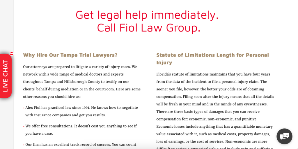 It is impossible to miss the large red print of their call-to-action, even if a user was quickly scrolling down the page. This reminds users to contact the law firm without having to navigate to a different page. Using clear CTAs can increase conversions by guiding users through the sales funnel.
4. Build a Simple Navigation
Your website should have optimized mapping and navigation for users to easily find their way around. Users should not have to guess where to find pertinent information, such as your Contact Us or About pages. Keep navigation as simple and intuitive as possible for easy browsing. You do not want to lose a customer at the checkout stage simply because he or she could not find the shopping cart.
Nike’s website provides a good example of simple but effective navigation:
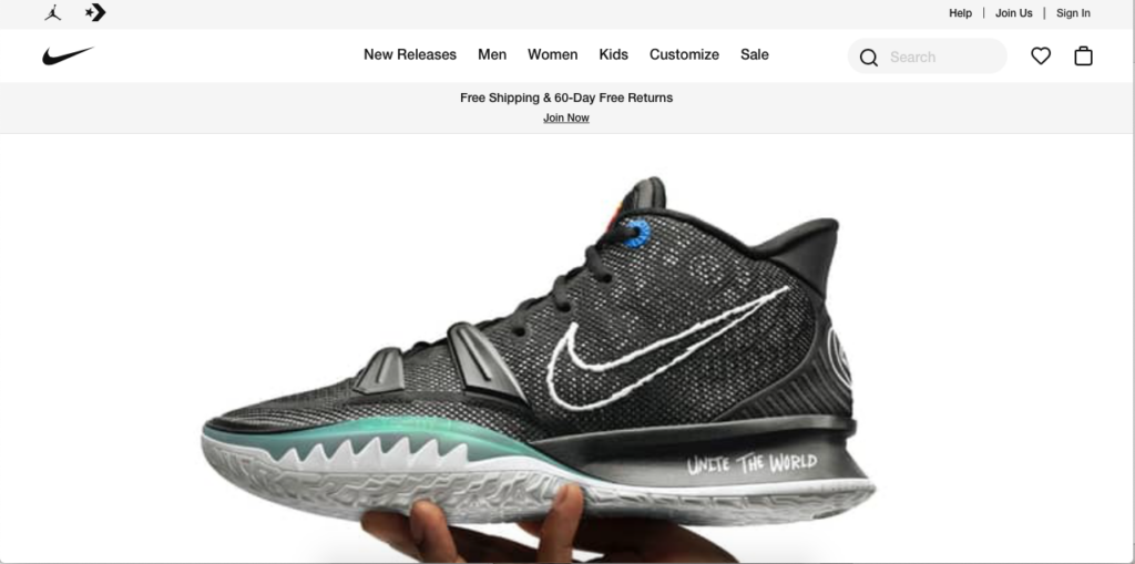 Hovering over the main categories accesses larger lists of navigation options:
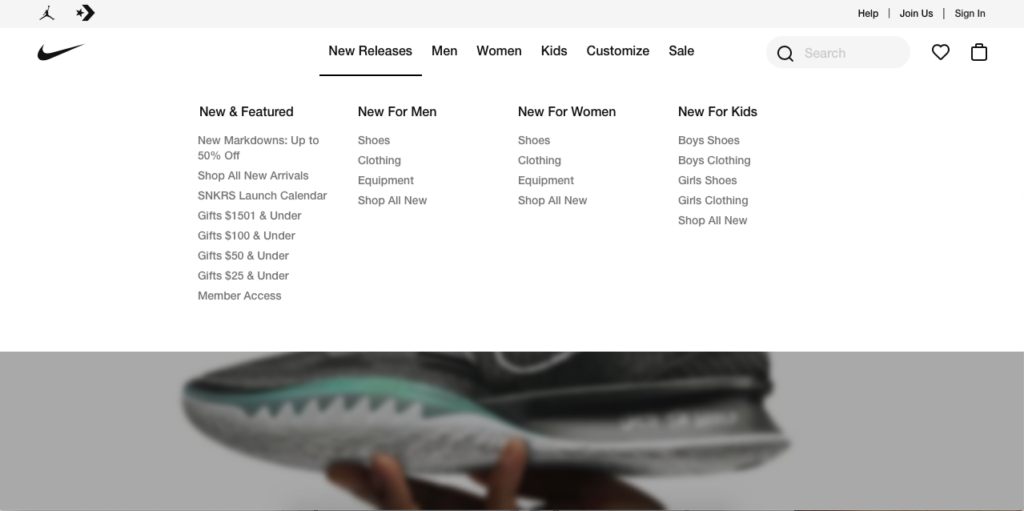 Navigation doesn’t have to be complicated. Make navigation as simple, smooth and predictable as possible. Your goal should be to lead your users easily around your website and through the stages of conversion: awareness, interest, evaluation, decision and action. Focus on easy navigation to improve the overall user-friendliness of your site.
5. Use High-Quality and Unique Images
Adding images to your website is an easy way to make it look better, increase functionality and improve the image of your brand. It shows you are a modern brand, which fosters trust and boosts the odds of making a sale. While the simplest way to incorporate images on your site is through a license-free photo site, such as Shutterstock or Pixabay, studies show that users react more positively to unique images. One study by USF Health found a 35% increase in the likelihood of customers signing up when presented with a unique photo vs. a stock photo.
209 NYC Dental does an excellent job at incorporating original photos:
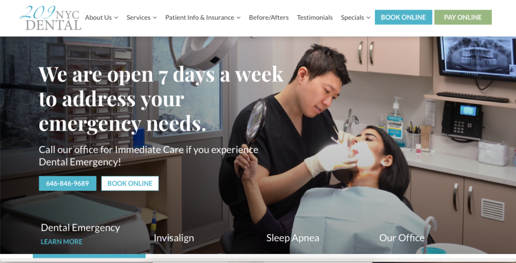 By using photos of real patients rather than stock images, 209 NYC Dental appears more genuine, honest and trustworthy. Investing the extra time and money to have professional photos taken of your actual business, staff members, products and services could make a big difference to your conversion rates. The quality of your images is also important. Users want to see clear, sharp images that load quickly across platforms.
6. Make Sure Content Satisfies User Intent
Last but certainly not least, make sure your content is on point. Google emphasizes the content of a website in its search engine optimization algorithms. Your content must walk the line between being informational and easy to read. Users want content they can quickly scan on main pages, such as your homepage, along with more in-depth content elsewhere on your website.
Your website’s content must be of the highest quality, with no grammar and punctuation errors. Most importantly, the content on each page must be original. Google penalizes sites with duplicate or plagiarized content.
Your website is a gateway to your customers. It is how people will find you, purchase your goods or services, and continue engaging with your brand for years to come. With these six tips, you will be well on your way to creating an optimized user-friendly website.
2246 Views

