Data Storytelling: Using Color for Emphasis
By: SEER Interactive

One of the first, and I would argue most important, things you learn as an analyst is that not everyone loves (or understands) data as much as you do. Whether it’s your first executive report or 20th weekly analysis, at some point, you are going to have an incredibly important insight to share, and you definitely don’t want it to fall on deaf ears.
“OK” you might say “that shouldn’t be too hard, just tell them what you found”. Eh.. it’s not always that easy. Remember those 5 hours you spent sifting through and pivoting all that data to get to your insight – yeah, how are you supposed to convey that to someone that only has 5 or 10 minutes to listen?
Data Storytelling
You may have heard of Data Storytelling or even met someone who is employed as a Data Storyteller (yes, that is a thing). If you have heard of the term(s), you’re likely not alone. Interest in Data Storytelling, as measured by Google Trends, has grown 6x since 2012, and for good reason.
As companies invest more time and money into data analysis, they want to see the returns on their investment. In other words, they want useful insights! But, more importantly, insights they understand and can utilize to enhance their business. You may be a great analyst, but if you can’t convey your findings in a way that makes sense to your audience, then your analysis is worthless.
To avoid allowing an incredible insight go to waste, here are some tips for using color in your analysis to tell a better story.
Drawing the eye
“What am I looking at?” If you’ve ever been on a call or in a meeting with an exec that has uttered this phrase, then this tip is for you. Instead of trying to explain how to draw the eye, I’m going to show you what this looks like in practice.
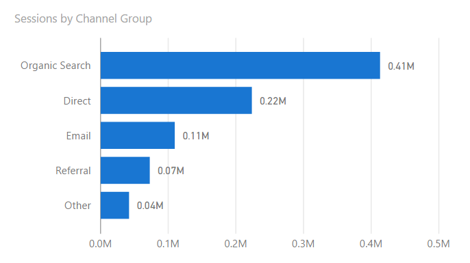
Take a gander at the chart below. Where should you look? Maybe at Organic Search because it’s at the top? Maybe at Email because it’s at the bottom? Maybe at all 4? Who knows.
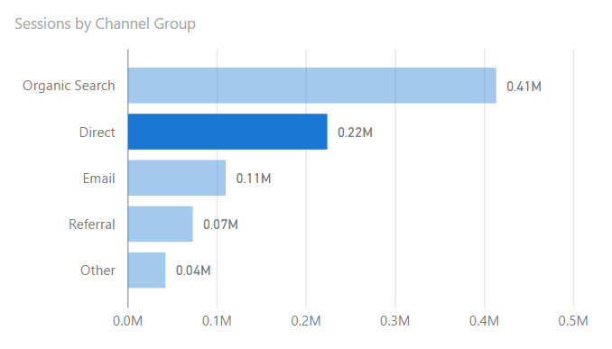
What about now, where should you look?
Your eye should go directly to Direct (pun intended). Even though it’s second in the chart? Yes! Why? Because my insight is about Direct and I want your eye to go straight to what I’m talking about. Why not just eliminate all the other information? Because context is important, but it’s not the most important.
Let’s try another example
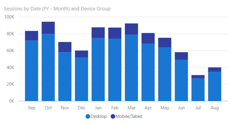
Where should you look? Maybe August, it’s last in the series? July looks low… maybe there? I think you get the idea now.
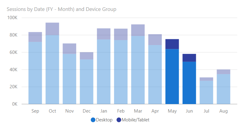
How about now, where should you look?
May and June right? Because my insight is about the drop between these two months, but I need the context of the rest of the year to emphasize how irregular the drop was.
So what have we learned?
The color(s) you use can have a strong impact on what your audience looks at. Why is this important? Because you want your insights to be as digestible for your audience as possible. If your audience can digest, they can understand, and then they can take action. Apply these principles and drive more action!


