ECommerce websites are nothing but strategically designed attention-grabbing visuals and content with the sole purpose of converting visitors into buyers.
Websites are the most prominent and tangible elements that customers see and interact with – which is why it is the most important part of your business.
Now, to make customers spend more time and money on your eCommerce website, you need to concentrate on its design. Your website design decides who stays and who goes, who clicks, and who keeps on scrolling.
So, you must have a very clear idea of what your site needs and where it has to be placed.
Have you ever come across an awesome eCommerce site that acts as a ‘conversion engine’ with simply exotic features and thought – “Wow! I wish my website was like that”?
Well, in this blog you will learn such 10 must-have features that your eCommerce website needs to really nail it upfront.
So, if you’re an eCommerce business owner, marketer, or website developer looking to amplify your brand with a conversion-driven website design, then don’t stop reading.
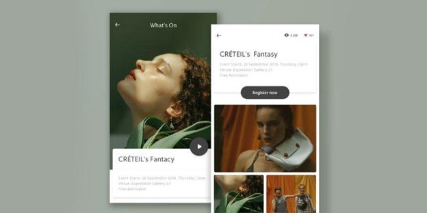
Design Element #1: Homepage
Though the homepage is not that direct “convert to money” page, it’s the place where people go when they want to know more about your business and its products.
 The homepage is the first impression you give your customers, and its purpose is simple.
- Intrigue customers to explore more
- Build trust and authority
- Engage customers and offer the next steps.
Therefore, its design needs to be more about branding and creating interest. Below are 5 major components that you need to consider utilizing your homepage real-estate for.
- Persistent search bar
- Thoughtful product categories on the main navigation
- Your story (Your purpose, sales & deals, value proposition, and more)
- Prompt for shoppers to scroll down
- Value and uniqueness highlighted
Design Element #2: Website layout
There are tons and tons of websites out there. To stand out from the crowd, you need to cut out from the normal ways and try something other than those standard templates.
 While crafting your website layout, pay attention to details.
- Dissect the design based on your purpose to create some kind of unique connection with your customers.
- Try playful distinctive layouts that involve storytelling.
- Give your users much more space and an easy scrolling experience to explore more.
- Make sure your layout gives a continuous flow with an impressive context to create a bond with the users
- Finally, it would be a nice touch if you could invest in creative ways to present your products in some new exceptional ways.
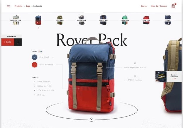
Design Element #3: Product images & videos
A picture says a thousand words. Yes, an eCommerce business is all about visuals – Images play a major part in all CRO solutions. Amazing pictures of your products in high definition and the apt background will do well.
 An eCommerce website converts like crazy when it has persuasive images in it. To boost your sales and conversions include,
- Professional pictures
- A 360-degree view
- Zoom option
- Short videos of the product
- Video clip of how to use the product
Design Element #4: Product description
Your product descriptions need to add value, build trust and credibility.
For instance, a potential customer may spot your product on Instagram or Facebook and may check more about it on your website. Though the customer is actually interested in what you’re offering, if it’s not addressed quickly and effectively, you may lose that potential customer forever.
Product descriptions are essentially the only way the customers get to know more about the product in terms of actual specifications and usage.
Thus, it needs to be precise, personalized and provoking. Succinct and powerful product descriptions that deliver the products’ uniqueness are sure to close sales.
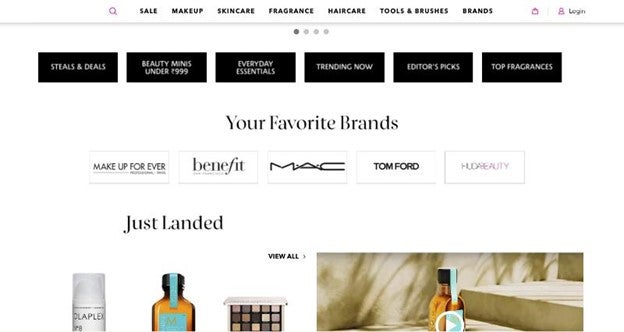
Design Element #5: Product categorization
Always keep in mind to design such that you offer the list of categories straight away to the users. Never hide it under a shop button or other website designs.
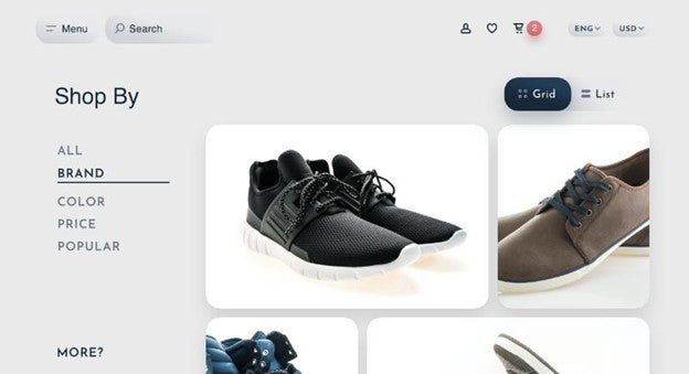 Clear and basic listing of all products available, makes it easy for customers to dive deep and find what they are looking for.
And it’s always better to have the main category on the home page or level 1. This way customers can directly navigate to the appropriate pages without too many clicks.
Based on the number of products available, list them clearly under suitable product lines. (Pretty much try to list all products under the main category itself, as too many subcategories can cause confusion.)
Design Element #6: CTA
CTA is the final nudge that is required to convert an intrigued customer. It creates a sense of urgency, improving conversions. Ergo, make sure your call-to-action is visible at multiple points throughout the website. Don’t just stop with a single CTA button on the header or footer.
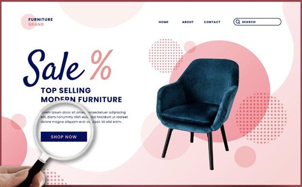 Featuring the CTA midway on the pages or using a floating “Add to cart” bar without disturbing the visitors are wise moves.
Remember, the 3 pivotal features of a powerful CTA:
- Value proposition
- Tone (Action-packed words) ·
- Design & positioning.
So, keep your CTA subtle, relevant, visible, and slick in all conditions (Including color, design, font style, & words used).
Design Element #7: Space for social proof
The ultimate goal of your website is to convert those lurkers into customers. If you want your customers to flock back again and again to your website, your eCommerce site needs to look really authentic and trustworthy.
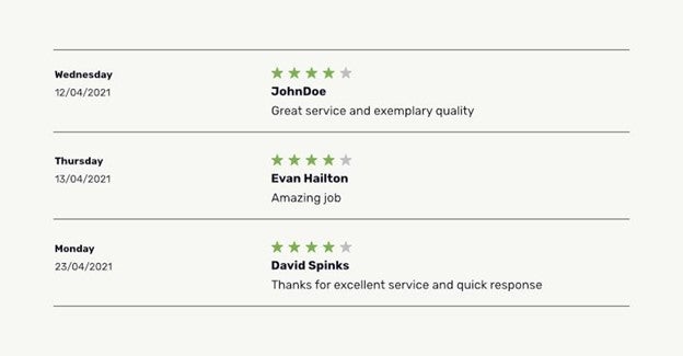 This can be done by sharing genuine customer reviews for each product/service on your site through writing, images, videos, or by providing star ratings.
You can also link your social media platforms to your site as it’s also a great way to build credibility.
Make sure you have your product ratings visible and made easy for all as literally 9 out of 10 customers check online reviews before purchasing.
Design Element #8: One-page checkout
Don’t let your customers get stranded in the middle of your website, guessing what to do next. Guide them with simple directions to checkout – It’s the eventual step that brings money into your account.
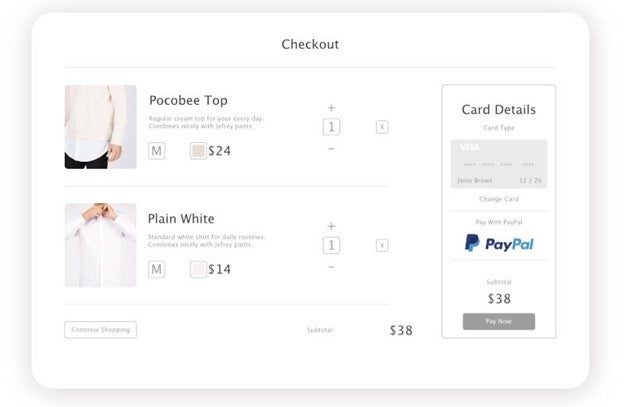 If you double your checkout process, you double the conversion, doubling your revenue.
Remember, the average cart abandonment rate out there is about 70%. So keep your checkout page,
- Simple & straightforward
- More transparent
- Zero bluff
Also, simplify the checkout process with the following.
- Prioritized CTA & payment button
- Multiple payment options
- Feature checkout summary
- Pre-stored payment details, billing, and shipping addresses
- Guest check out or social checkout options
- Single-click checkout if necessary.
- Highlighted security seals
- Remove unnecessary or redundant form fields
- Eliminate distractions on the checkout page
Design Element #9: Optimize for mobile
Around 54% of the total eCommerce sales across the world happen through mobile phones and by 2024, the count of mobile shoppers in the US is expected to surpass 187 million.
Having this in mind, design your eCommerce site mobile friendly. You can either have a responsive web design approach or get a mobile version for your estore.
Also, see that your site is mobile optimized allowing fast load times, even with a slow internet connection.
Simple navigation, easy checkout, positioning of CTAs, refining the features, and utilizing every inch of space available without making it look congested or over-dumped is the key here.
Design element #10: Recommendation & suggestions
Give your customers a one-to-one shopping experience through personalized product recommendations.
Even a well-designed site can overwhelm the visitors with multitudinous products. As per studies, when the number of options increases the purchase count actually reduces. Thus, to get around this it’s smart to include recommendations on your site.
By displaying additional categories such as trending products, recently viewed, and new arrivals you direct customers to suitable products.
Other recommendation types you may consider including to your website are,
- Recently viewed
- Similar products
- Products you may like
- Upsell recommendations
- Customers also bought
- Post-purchase, cross-sell
- Add-on recommendations
- Bestsellers and top-rated
- Product bundles
This saves time and eliminates unnecessary confusion for the shoppers enhancing their shopping experience.
Conclusion
All right, those are the 10 design elements that you can’t miss while crafting a massive conversion eCommerce site. To amplify your brand, you need to scrutinize all the design aspects of your website and make sure you get it perfect.
But the most important tip is that not all designs and all businesses are equal. Thus, you need to design your site based on the product/service you sell, the customer base, and traffic source.
You get the drift?
eCommerce sites are meant to be apt, powerful, and precise to your business. Your eCommerce website is the bridge that connects you and your customers.
Thus, spruce up this bridge with the right design. Reach out to The Commerce Shop for all your eCommerce development services.
2186 Views
Trending Articles