Do you regularly check your website and test all the processes? Otherwise, how will you know how many visitors are leaving without following through on your calls to action?
If you want visitors to “convert,” i.e. purchase, complete a form, upgrade products or services, sign up for emails, donate, etc., you must be vigilant and watchful.
One thing is guaranteed: when you use technology, you’re likely to experience glitches and boo-boos. This can be especially frustrating when you rely on third-party software and tools. I can’t tell you how many hours (if not days) I’ve spent troubleshooting issues that have driven me nuts!
Here’s a list of some common issues to check:
Effective site navigation
According to WordPress.com, it’s important to make navigating your website intuitive so that visitors and potential customers can easily find what they’re looking for.
“The navigation bar, or menu, is your site’s roadmap. Clearly mark where each link leads. Don’t use jargon or obscure terms to describe site sections. The labels ‘Products,’ ‘Services,’ ‘Blog,’ ‘About Us,’ and ‘Contact’ often appear in the menus of websites for a reason: they’re straightforward and easy to understand. Ensure that your site hierarchy makes sense. Place links to subpages under the appropriate menu tabs.”
If you and your team are too familiar with your website, ask others to test its site navigation for you. Brief them on some of the common things that visitors search and ask them to report on their experiences. Encourage them to browse on their own, too.
Accessible contact information
Firstly, is your contact information available and easily accessible? If prospects and customers can’t contact you with questions, why would they trust you?
Make sure that your site has a Contact page. Include your email addresses, mailing address, telephone number, office hours, and time zone (if you serve customers outside yours). Even if your organization is virtual or home-based, it’s important to have these contacts for credibility.
Social sharing options
If you want to encourage social media (SM) engagement, your SM icons should be easy to find. No one is going to spend time searching for them if they aren’t immediately visible.
Include them in your header or footer so that they appear on every page. And, most importantly, check the links regularly. I’ve experienced glitches with my social media icons after some WordPress updates.
Broken links
This one is so common and easy to fix. Unless you use a special plugin or SaaS program to detect your site’s broken links, you probably don’t know that there’s a problem.
According to Broken Link Checker: “Why having broken weblinks is so bad?”
“Dead hyperlinks on websites are not just annoying – their existence may cause some real damage to your online business as well as to your reputation in the Internet!
Because of that a website may:
- Lose some of the existing customer base (current users sooner or later will get frustrated enough to never come back)
- Get problems with getting new customers (because of the dead weblinks people simply won’t be finding things/pages they are looking for).
- Damage your reputation online (most of online customers consider stale hyperlinks as demonstration of no respect to them from the site’s owners)
- Have negative impact on your website’s ratings with major Search Engines like Google, Yahoo, Bing, etc.”
Broken links are frustrating for your site visitors, and if you want them to return, check them regularly. Here are some tools to help:
Atomseo (5 free reports per day)
Broken Link Checker (WordPress plugin free)
Broken Link Checker (free)
Dead Link Checker (free)
Dr. Link Check (free for up to 7500 links per month)
Screaming Frog SEO Spider (free for crawling up to 500 URLs)
404 not found error
According to 404 Monitor by Rank Math:
“404 errors occur when a user tries to access a page that does not exist. This can be your fault, the user’s fault, or the fault of a website linking to your website. It’s OK to encounter 404 errors on a website, especially a growing website. What’s not OK is not to fix the 404 errors. Not fixing 404 errors can lead to dissatisfied users, loss of search engine traffic, and a thinner bottom line.”
You can use your broken link checker to find and fix broken links. Whether there are broken links, or a visitor mistypes a url, it’s important that your 404 error page ties into your brand.
If you don’t have someone to create yours, here are some available templates:
30+ Free HTML 404 Error Page Website Templates
35 Best Free 404 Error Page Website Templates
Registration and subscription forms
According to American Press Institute, “The importance of user-friendly registration and subscription pages should not be underestimated. Designed well, they capture needed revenue and strengthen connections with readers. Designed poorly, they push potential subscribers out the door.”
Even if you follow best practices for creating forms, it’s imperative that you periodically test them. Don’t wait for a web visitor to tell you, because most won’t! Ask friends or employees to test your registration process.
Here’s an excellent resource from HubSpot:
Form Design Best Practices: 15 Tips to Boost Conversions and UX
Checkout process
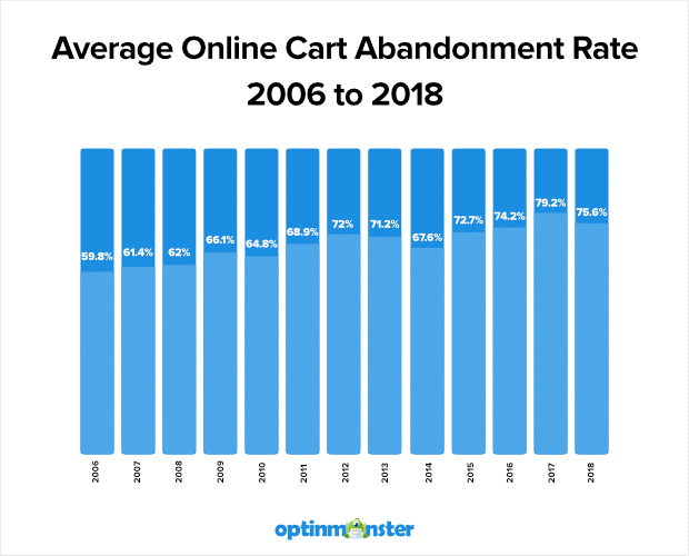
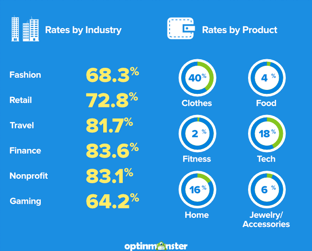
There’s nothing more frustrating than trying to buy something online and experiencing glitches. According to Moosend, “[Shopping] cart abandonment is a term we use to describe the instances of incomplete purchases on online environments. By and large, it refers to potential eCommerce store customers who add products to their carts and drop out before they complete the checkout process.”
Abandonment is especially critical for nonprofit organizations accepting online donations. Undetected problems can detrimentally affect fundraising revenue.
There are excellent recommendations in this article by OptinMonster:
5 Cart Abandonment Stats to Help You Win “Lost” Sales Now
There are many other website glitches that occur in addition to these. Regularly take a fresh look at your content to find and fix these nuisances!


