Do you know that your users need just a few seconds to make a decision on whether to use your product or not? In fact, what they see and how they feel when using your app or website is the key to success. If your goal is to integrate a software solution into your business processes or develop software for your customers, the role of design is no less significant.
With a simple and clear design, your users won’t have to spend time thinking about how to use the software. You won’t have to train your employees (or at least you’ll minimize the time for onboarding). Instead, by offering them a convenient way to perform their tasks, you succeed in automating their work. That’s why it’s so important to know the principles of good software design and develop it accordingly.
In this article, we’ll describe 7 common rules of creating a cool UI/UX design many people just forget about. Learn how to ensure an amazing user experience and attract your audience. Let’s start our small journey!
7 Common principles of good software design
It’s so challenging to attract users and convince them to stay with you. It’s not enough to solve their problems and that’s it, or provide them with a great user experience without adding value, or just to put a lot of money and effort into marketing.
To generate profit and build customer loyalty, you should really take care of your audience.
Value + experience + intuitiveness is your success formula. Following are some crucial principles of good software design that will help you achieve this combination.
1. Demonstrate the value of your product from the first second
Show the value on the first screen or page of your solution, outline the main advantage, and accompany it with a clear call to action. Several words describing the essence of your app/site will be enough. If you have, for example, a web platform for buying, selling, and renting real estate, write something like “Find your perfect home” and place buttons “Book”, “Sell”, and “Rent.”
A great way to attract and inflame your audience and build their loyalty is to make a friendly gesture; for instance, offer a free trial or a promo code. It is truly helpful if you don’t have a famous name and do need to increase brand awareness.
Read more on best UI designs
2. Don’t oblige your users to register to access your product
Don’t oblige people to immediately register and create an account, especially if your brand isn’t world-famous like Facebook. By doing so, you will just deter them from using your product.
Instead, allow your users to access the key functionality without registration. Say you have an online store or an online delivery service. Ask your customers to register before making an order. This will be appreciated by users and enable you to increase sales.
3. Make a user interface design as simple as possible
When creating UI/UX design of your software product, make its interface as simple as possible. Even if you’re building a comprehensive solution and need to implement rich functionality (we’ll talk about it a little bit later), don’t overwhelm it with plenty of elements. The interface of your app or website should be clear, simple and usable.
To this end, ensure your product doesn’t have the same or similar functionality on different screens. This will only confuse your users and make their journey less pleasant. Combine similarities in one place instead of fragmenting the UI.
Also, adhere to design standards that have evolved over the years. Most modern software solutions don’t make users think about doing something, for example, about searching for a “close window” or a button with the necessary call to action (CTA).
This is because we’ve got used to finding some things in a certain place. To avoid confusion and provide seamless user experience, place important elements like CTA buttons, search fields, and close windows where your users expect them to see.
Another important thing to do when making a cool UI/UX design is to minimize the number of input fields. Define must-have fields and remove all the others. If many fields are required, don’t place all of them on the same screen/page. Instead, display them in succession, no more than 10 fields on one screen/page.
Put a search field(s) in a visible place, make a simple and convenient menu, use bright colours for buttons to highlight them and attract user attention. Play in contrast, it really works.
4. Implement intuitive navigation of your product
The creation of intuitive navigation is one of the most crucial software design principles. To win the audience, the interface of your web or mobile solution should be created in such a manner that people use it even without thinking.
When opening the app or website, the user should be able to quickly and easily find the desired content. You should also provide clear guidance so that each page will logically lead a person to another one. Make the transition between pages fast and simple.
During the process of interacting with your product, the user may need to go back. In view of this, the “Back” button should be placed on each page so that he or she doesn’t have to start all over again. This means going to the main page, losing all the data entered… Just imagine how irritating it is! So, offer your users the ability to go to the previous page.
Therefore, by implementing intuitive navigation, you save your audience time and add value to them. This has a direct correlation with the level of user satisfaction and conversion rate. The more you care about users, the higher they are.
5. Start small, start with MVP development
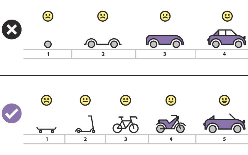
We’ve already mentioned that you should make the interface as simple as possible. However, this is much easier to achieve if you need to implement only the key functionality. Besides software engineering, the principle “Start small” or MVP (minimum viable product) development works well in web and mobile design, too.
MVP development means that you define the main task of your app/website, the feature (generally, 1-2 features) that will enable to solve it and leave other features behind. Developers quickly create a working solution (MVP) for you to test your idea in action. Then, you collect user feedback, measure the reaction, and extend and change the product accordingly.
Thanks to this approach, you get to know your target audience, their needs and preferences, and build a solution that perfectly fits it. As a result, you will gain the hearts of your users, popularity, and boost sales. Thus, MVP development enables to save time and reduce costs.
Source: informir.eu
Let’s see how it looks in practice. Say you want to build a mobile or web app for reserving hotel rooms/apartments in Europe. Therefore, tour booking is the top-priority feature. So when making a software design, your task is to allow booking in a few clicks.
This will require a search field and the booking itself. That will be enough for the first version of your application. To implement this functionality in design, you should add such things as the main screen that will provide the ability to search and include the list of search results and a screen with the booking information.
Make the search process as simple as possible, put all the necessary buttons in a visible place, and don’t overload the app with plenty of elements. As a result, you’ll get a working solution for further testing and extension. Later, you can gradually integrate booking of cars, taxis, flights, and tours, reviews, ratings, information about sights and historic spots, online payment, etc.
6. Take care of the content organization
The convenience and simplicity of the product are one of the fundamental factors of its usability. And content takes the center stage here. When you create websites or apps, you should make your content logically structured. Nothing should draw the user’s attention from information perception.
Structure, design, informativity, logical breakdown, optimization, lack of errors—all these things should be taken into account when developing content. If you need to publish a long text guide, add a table of content in the form of links so that the user can quickly find the desired section.
The length of the page doesn’t play an essential role. A well-thought-out structure of text and graphics – a selection of priority information, a sequence of the arrangement, etc.—is much more important.
Interact with your user. Successful registration, accepted order, non-existent page – he or she should always be aware of what is happening. Say what to do next after registration. If the order is accepted, indicate contact details and the time during which a manager will call. If the user has gotten to page 404, there should be clear instructions on how to find the necessary information or where to return.
Offer help gently, don’t insist on communication. Large pop-up windows that offer assistance or ask to subscribe, a coloured bar with a phone number that occupies a third of the screen—such elements not only look intrusive and repel the visitor but also cover a part of the functionality. The help window should be easy to hide, buttons and icons need to be made noticeable – not merging with the background.
In addition, provide people with the ability to undo an action, it does matter. As an example, most online stores let users edit or delete their orders and change the delivery and payment method. Remember that by facilitating the life of your customers you get the conversion rate increased.
7. Adhere to one brand style
The creation of a unique brand style or adherence to the existing one is one of the most important software design principles. It will look weird if different styles and colours are used on your website or application. When the same things are decorated in different ways on different screens or pages, it can also confuse the user.
If you take a look at Starbucks, you can notice that the brand uses the same fonts, colours, and other elements everywhere, from the company’s site to social networks. This approach helped Starbucks build a world-famous brand.
Therefore, by developing your own brand style you kill two birds with one stone. First, you strengthen your brand. Second, you don’t confuse your users and make your web or mobile design more clear and logical.
Final thoughts
Mobile and web design is an essential part of the software engineering process. Even if you’ve built a truly unique product but overloaded it with numerous elements and colors, you’ll lose customers and won’t generate profit.
The way you implement your functionality in design directly affects project success. That’s why you should take into account your audience’s needs and preferences from the very beginning and create UI/UX design accordingly. Test ideas on real users and analyze their reaction. This will let you validate them faster and save costs.
Follow these 7 software design principles to create a cool solution and ensure the seamless user experience. If you have questions about the topic or want to build the app/website, feel free to contact us. With more than 5 years’ experience in making product design, we’ll be glad to help you.
7144 Views


