")
Surviving in the Multi-Device Era: How to Make Your Website Responsive
By: Andrei Klubnikin

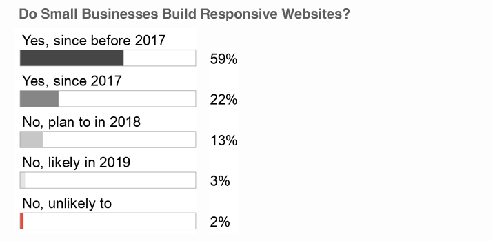
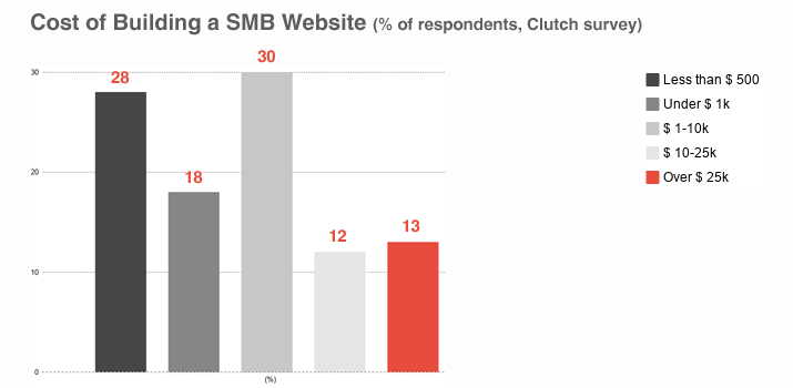
It’s 2018, and websites are more affordable than ever; in fact, 28% of small businesses spend less than $500 to build one! According to a recent Clutch.co survey, however, only 64% of SMBs do have websites—and 81% of those are mobile-friendly. It’s a huge leap from 2016 when just a small fraction of corporate websites looked good on smartphones and tablets.
Why do your competitors take the trouble to build multi-device sites? What exactly is a responsive website and what makes it different from mobile-friendly and mobile-optimized websites? You will find the answers here!
Responsive websites & why you need one
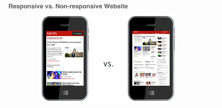
A responsive site does exactly what it says on the tin—that is, adjusts its layout to fit any screen size, thus improving mobile user experience.
Unlike mobile-friendly sites which simply load faster on smaller devices and utilize certain capabilities of mobile devices (for example, click-to-call links) or mobile-optimized sites which are designed specifically for smartphones and have the “mobile” or “m” prefix in their URL, responsive websites automatically detect the type of a device used by your customer and resize page elements in proportion to other user interface (UI) components.
If your traditional desktop website, for instance, displays an image and four columns below it, a responsive website will organize content into one vertical column which can be viewed in the portrait or landscape mode; the image will stay within the lines, too.
A picture is worth a thousand words, so here’s one:
Having a responsive website is key to survival in a constantly changing business environment—and I have some shocking stats to back up the argument:
- In early 2017, mobile website traffic reached 50.3%, thus overtaking desktop for the first time. It has been on the rise ever since;
- By 2020, mobile will drive 45% of all e-commerce sales;
- 57% of customers won’t refer a company to a friend unless their website is optimized for smartphones and tablets;
- 80% of users will not engage with content that looks awful on a smaller screen;
- 83% of active mobile users believe a seamless experience across all devices is extremely important.
With a responsive website, you will:
- Reduce website development and maintenance costs (you don’t need to build two separate sites for desktop and mobile devices and keep them up-to-date);
- Boost sales and conversion rate (by choosing the responsive approach to website design, brands like O’Neill, Think Thank Photo and Walmart managed to increase mobile conversion rate by 20-407% and reported record revenues);
- Increase online visibility (having a website that is easy to read and navigate translates into longer time on page and decreased bounce rate—and that’s what Google loves. Also, your website will load faster, while easy social sharing will help you grow your audience at no cost).
How to make a website responsive?
Basically, you’ve got three options here:
- Choose a website builder. There’s a plethora of “what you see is what you get” website development solutions like Weebly, Squarespace and Wix offering responsive design themes by default. You don’t need any coding experience or even basic knowledge of HTML and CSS to create such a website: you simply drag and drop UI elements from the toolbar on to a blank canvas and publish your masterpiece.
However, it’s not all rainbows and unicorns. Do-it-yourself websites are hosted ones, which means you’ll have pay a monthly fee for storage space, custom domain name and extra features like an online catalog or ad blockers.
The maintenance of a Wix site, for instance, will cost you anywhere between $4 and $24 per month. Also, it won’t be easy to customize your design theme or migrate the website to a CMS like Drupal or WordPress once your business outgrows Wix capabilities, so you’ll end up working with a PHP development company anyway. - Learn HTML and CSS. You wonder how to make a business website responsive without hiring developers? There are many cool responsive website design tutorials like this one on the Internet; provided you take the time to learn HTML and CSS, you can do the job on your own.
The amateur approach has its drawbacks, too. There’s more to responsive design than breakpoints (that is, browser widths that change layouts once a web browser is within a specified range). Your customers are here for cleaner, simpler experience—and that’s why you need to have a special way of thinking to move UI design towards the context of the user!
Here’s what I mean. Let’s say you run an insurance company. 85% of Americans research insurance policies online. 73% of those choose a laptop or desktop computer for that, while 9% of customers (mostly Gen Ys and Millennials) use their smartphones.
In case of emergency, however, your customers will use their smartphones to look up your phone number or clarify their insurance policy details. Do you really have to display all the information that is available on the desktop version of your site to users who hit your website on the fly?
If not, what data should be prioritized? Unless you are a UX designer, you’ll have a hard time answering these questions.
- Hire developers. Whether you do have a mobile-unfriendly website or consider building a business website from scratch, getting professional help will do you a lot of good. Yes, it will cost you $9k to 15k to put up a high-performance responsive website built with WordPress or Drupal, but the truth is, websites are highly underpriced these days. A team of professional developers does not create web pages using drag-and-droppable elements; instead, they do some through work both on the front end and back end to make sure the website is scalable, set up properly and aligned with your business goals.
What approach should you take?
It depends on several factors including your website development budget, the business tools you’re planning to integrate your website with, as well as your growth strategy. One thing is for sure, though: in a world where mobile devices will soon account for 79% of the Internet usage, having a responsive website is the only way to win customers’ attention (and money).
2664 Views
Trending Articles


