")

Whether or not you put research, money and effort in to your brand, it will still be designed. Through many years of small business startups and made-from-scratch marketing, I’ve learned that crummy design can blight your business as much as sophisticated design can enhance it.
Like the burned-out letter on the storefront sign, poor or outdated design signals to potential customers that you don’t care about your business. Or that you lack the savvy to offer the best product or service. In an age when platforms like Canva and Squarespace bring high-end design within reach of the layperson, a negligent design stands out even more.
Despite the ubiquity of template-based design platforms, many business owners feel hopelessly overwhelmed in this arena. Design can seem like a constantly shifting morass of soft-science opinions and trends. While there is truth in this observation, wrapping your head around some design techniques is an attainable goal. Hang in there as we get ahead of the curve with advice from the design experts at 99designs with seven graphic design trends for 2019.
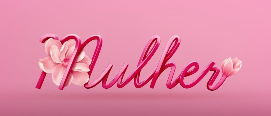
#1 3D Imagery & Typography
This first one is easy to explain, increasingly straightforward to implement, but dangerously difficult to master. With the proliferation of online content, people’s screen time on individual images is frighteningly brief. As a business owner, you have a narrow opportunity to get that scroller to stop and engage with your business. One of the easiest ways to grab attention is to have images, logos, or brand names (quite literally) pop out at them.
However, as we will discuss later, subtlety can also be an effective tool. If potential customers feel intruded upon by the advertisement, logo or banner, they may move on quickly. The key is to integrate the 3D portion of your design with the rest so that it acts as a harbinger of the bulk of your content. If this is your first rodeo, you may want to outsource the design of these pivotal elements. Or, if you feel 3D imagery is a bit heavy-handed for your brand, try our second suggestion…
#2 Isometric Designs
In the most basic terms, an isometric design is a compromise between a 3D and a 2D image. This increasingly popular technique gives art and icons a more realistic look while utilizing flat layers. Isometric design marries the depth of 3D illustration with the simplicity of two-dimensional imagery. As an added bonus, the file size of these images is much smaller than 3D, allowing online content to load more quickly.
Currently, isometric design work is utilized heavily for clickable icons, but the style has increasingly dynamic appeal. You may have a hard time envisioning the technique from a textual description, but once you lock eyes on some examples, you will start noticing it everywhere.
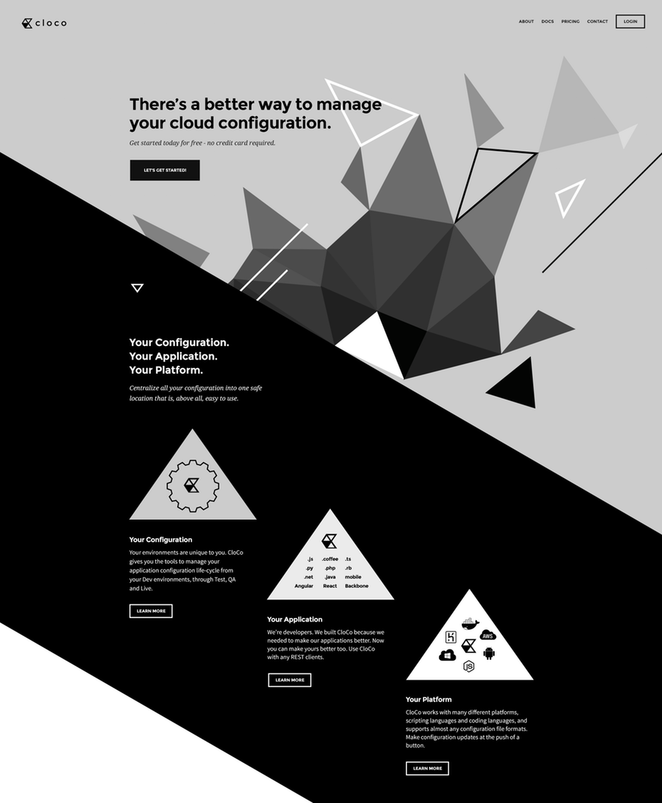
#3 Asymmetrical Designs
Like 3D Imagery, the concept of asymmetrical design is easy to conceptualize and difficult to execute successfully. Symmetrical design is tried-and-true, predictable, and visually pleasing. However, it’s not very exciting. It’s static. The designs themselves don’t suggest the next move. However, you don’t go from symmetrical design to successful asymmetrical design by just shifting everything off-center.
The key to successful asymmetrical design is movement. Whether it involves human/animal figures or simply conceptual images, asymmetrical design elements encourage the customer to follow them somewhere. The images on page one are a natural call-to-action… leading to page two… and so on.
#4 Proactive Negative Space
In visual art, negative space is the space around the primary image. The manipulation of negative space for visual appeal, often to cleverly communicate a hidden message, has been going on for some time. If you’ve ever enjoyed the art of M.C. Escher, you’ve seen how negative space can be used to play on the concepts of perspective and perception.
Being proactive with negative space means using that space intentionally. Often this comes in the form of an image that becomes apparent when viewers relax their attention from the primary messaging. This technique makes better use of all available space and can express the detail of your design to observant consumers.
#5 Dynamic Logos
In branding, experts used to give very stern advice against ever altering your primary logo, the concern being a serious loss of brand momentum. However, with the current nature of digital, multi-platform advertising, having a dynamic logo is a must.
Notably, you should develop versions of your logo for digital vs. print and within digital for viewing on desktop, tablet and mobile. It is also advisable to generate horizontal vs. vertical orientations and robust vs. stripped down iterations.
#6 Serifs
If you’ve ever paid attention to Font names, you’ve probably seen this word. Before reading this article, did you actually know what it meant?
Serifs are stylized projections that finish off the characters in certain typefaces. (Sans Serif means ‘without serif.’) They can congest the look of body copy and are generally considered old-fashioned. Until recently, most designers eschewed the use of serifs for these reasons.
However, like so many other cyclical things in design, serifs are making a comeback. While they’re still not favored for dense text, fonts with serifs are appearing more and more in logos, titles and headers. If you want to stay ahead of the textual design curve, consider incorporating them. Speaking of old-fashioned…
#7 Vintage Looks
It’s no secret that, when used properly, vintage style can make a very powerful statement. Currently, two vintage design styles are making a come-back.
Art Deco
Think ‘The Great Gatsby.’ Launched during the booze and vice-soaked Roaring 20s, this post-WWI design was (and is) stylized and extremely ornate. Expressed prevalently in fonts and logo design, the style emphasizes symmetry, thin lines, and metallic finishes.
Mid Century Modern
Now, think ‘Mad Men.’ This design style was originally a reaction to (and compensation for) the corporate fat-cat hedonism of the Art Deco movement. Embracing function over form, Mid Century Modern art, architecture and design utilizes minimalistic swooping lines. By nature, it is individualist and quirky. Recently, this trend has been solidly escalating in fashion and home décor and has started to cross over into digital and print marketing.
The Paradox of Mass Marketing
You may have noticed a few paradoxical suggestions in this article. Old and new. Simple and ornate. Reserved and grandiose. For better or worse, this is the complex, subjective and very ‘human’ nature of design. The good news is that there are a lot of ways to get it right. When it comes to embracing the best graphic design trends for your small business, the key is conveying that you care. If you put as much consideration into your design as you do into your product or service, potential customers will notice. Consciously or subconsciously, you are convincing each of them that you are a purveyor who cares about details.
Trending Articles