")

Most cities, towns and countries who take on the task to develop their brands spend a great deal of money essentially changing their logos under the pretense that their logo is their brand. It is their belief that a new logo and tagline will encourage investment in their communities. This belief makes little sense in the real world outside government chambers. If changing the logo can improve a brand then changing a logo on a product can make it taste better. Same logic, and of course same result. Failure.
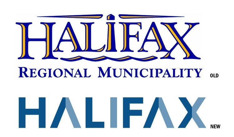
My home town of Halifax, Nova Scotia recently spent a quarter million dollars “rebranding”. Swell. When you see the result, you don’t see any positioning of Halifax. My guess is that nothing was addressed to correct deficiencies with the brand (or reputation) in my book. What you do have is a rather uninspired logo with a typical palette and a huge rationale as to why it makes sense. Here’s how they explain the logo in their words: “The new Halifax logo is bold in its simplicity. Like our region, the logo is not cluttered, over-embellished or contrived. Its strength is in its simplicity, and its simplicity makes a bold statement. Clean, geometric lines bring quiet strength, energy and balance. It has subtle nods to upward momentum and forward progress. While the colour palette is based on bright colours from our local environment and nature, the base colours are shades of blue, which represent our many lakes, the ocean and the sky.”
Because they state that the logo is “Bold,” guess what their tagline is? “Be Bold.” Does that mean you have to be bold to invest in the HRM? Is it that risky that you have to go out on a limb to put your money there? To be fair, Halifax is not unlike most other place brands that attempt to engage branding. Even if they do understand that a re-brand is not a logo change, they all seem to think that the logo has to come with some massive rationale as to why it was designed the way it was. They are so afraid politically that the people will shun the effort, they concoct all the symbolism involved in its design. Take a line from Halifax’s rationale: “It has subtle nods to upward momentum and forward progress.” Is this why they used the roman A’s? (what look like upside down V’s)
Who is going to explain all of this to the outside world? Do Google and Apple fail because their brand logos were never explained away? In all my 35 years in the graphic design industry I’ve only had to provide a rationale once, maybe twice, and it was done AFTER the design was complete, not as a criteria to design it in the first place. We dreamed up a reason why we did what we did to satisfy the client.
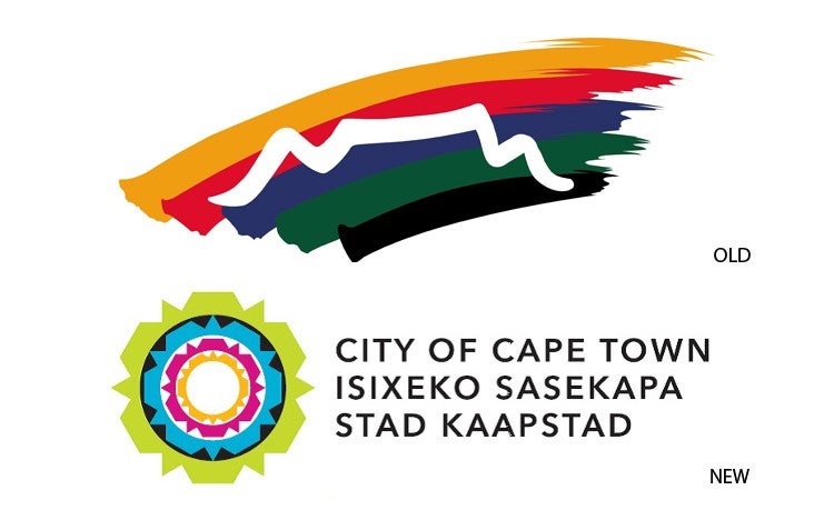
Another fine example of over-explaining Place Brand Logos defined as re-branding is Capetown, South Africa. Their new logo is so bad they even made a video to explain the rationale. I guess they felt just describing it in text wouldn’t cut it. Judge for yourself: http://www.youtube.com/watch?v=kikjgHNyOlc
The sad truth is that most places should define their brands and make them as powerful as they can. It is too much to expect that putting huge goals like “new investment” can be achieved with a simple logo and tagline change. In reality the logo is the face of the brand and what lies beneath that sometimes isn’t pretty. A pretty face on an ugly brand is a train wreck waiting to happen. This same truth goes for business brands as well. It is said that beauty is only skin deep and that goes for branding as well. A rationale is useless in the marketplace where your logo has to stand on its own. If it was designed with its audience in mind it should resonate with them. A rationale is a vague attempt to convince one to see what I am seeing. The sad truth is rationalizing draws criticism. You can’t please everyone and you either get it or you don’t. If your brand (reputation) is strong then what ever logo you concoct will represent that great brand—even a poor design.
There are lots of great brands with bad logos. The ultimate goal is to attain both a great brand represented by a logo that resonates with its audience.
Published: April 23, 2014
2153 Views
2153 Views
Trending Articles


Stay up to date with